Contest #9: entries (rewritten)
Here are the entries for contest 9. As usual your entries blew me away!
As usual, each entry is displayed with constructive criticism to praise you and to provide an area or two of improvement.
This is a rewritten version because I was an idiot and deleted the wrong chapter. The feedback is also shorter because I don't remember what I put originally and I've been busy at work and I've been sick this week.
Let's begin!
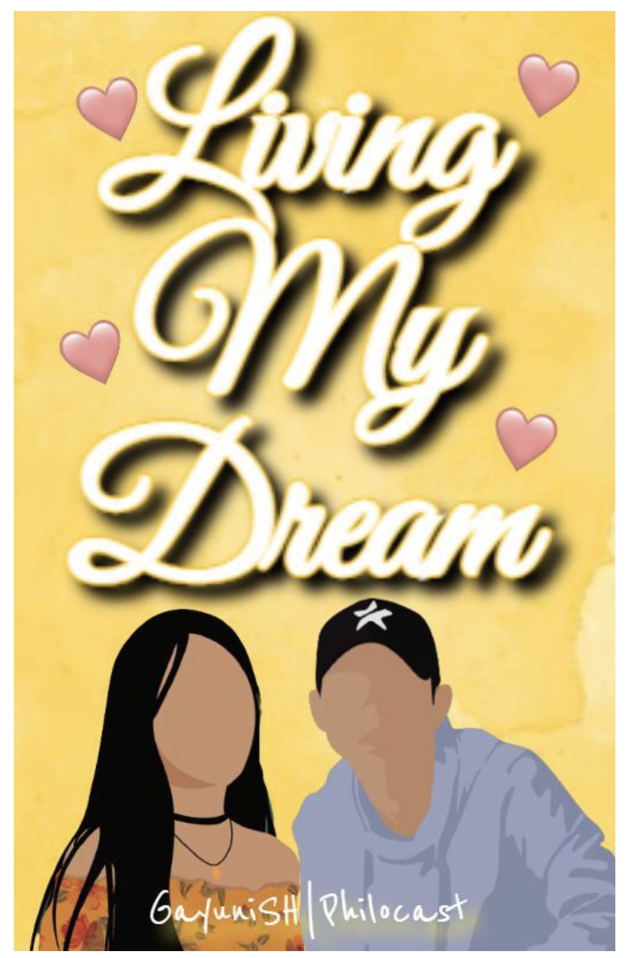
I really like the yellow watercolour background! It's simple and it works really well. I really like how you went for a vector style! The pink hearts are nice but I personally don't think they match the rest of the cover. I really like the font you used! However, I think the shadow is a little too heavy. Tje shadow may have only come out that heavy because the font is yellow so it's blending into the background a little bit. I personally think that the letters are too squashed together, especially in living. The only thing missing is a subtitle (which was mandatory) but other than that, it's a really nice entry!
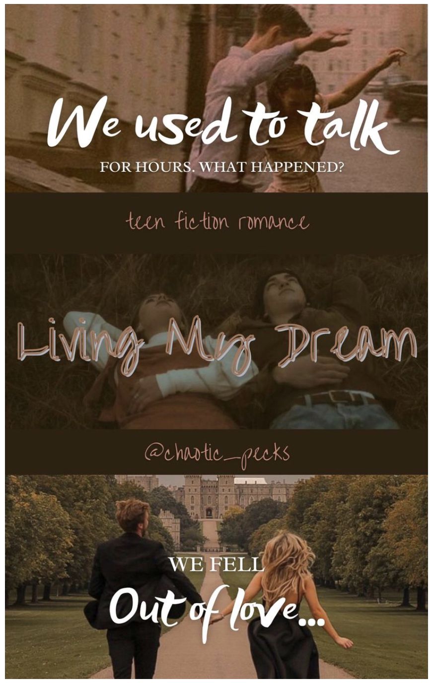
I really like how you used three pictures! They're evenly spaced out across the cover. However, I feel like the bottom picture doesn't quite match the top two. The other two seem to have similar (or maybe the same) filter (s) on them whereas the third one doesn't. The colour you used to separate the pictures is nice and it goes really well. The fonts you've used are really nice and go well together, however, I feel like the font of "we used to talk" and "out of love" is a little too thick. The two colour title is really nice and your subtitle is really creative!
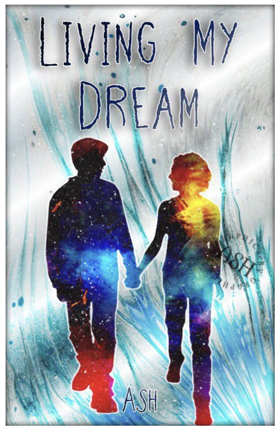
I really like all the recolouring you did! It pays off and the blues match together nicely! The couple is a nice touch. I personally wouldn't have chosen the font you chose but I don't hate it. I like the texture you put into the couple, it's really nice and matches the rest of the cover! The only thing missing is a subtitle (which was mandatory) but other than that, it's a really nice entry!
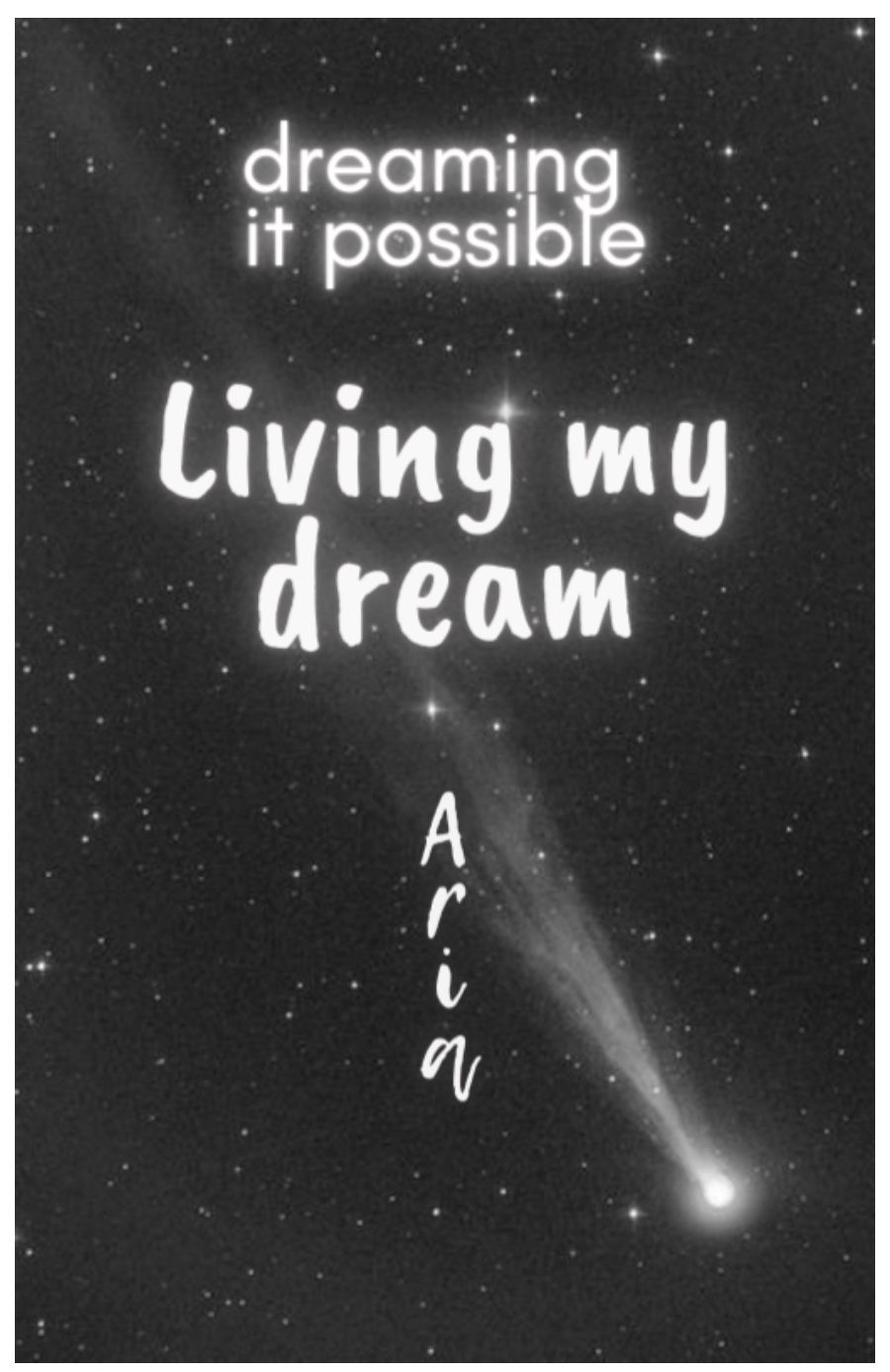
I really like the simplicity of the cover. The space background is nice. The title font is nice but it could've been experimented with more. The subtitle is really creative, however, the font could've been experimented with more. Your name going vertically is a nice touch as well.

I really like the two image background, it's really nice and was pulled off really well. The two coloured title is nice but I feel like the orange doesn't match your blue colour scheme. The font is nice but I feel like the font could've been experimented with more. The couple is really nice! The only thing missing is a subtitle (which was mandatory) but other than that, it's a really nice entry!

I really like the two image background! The images go really well together. However, there is a harsh line where the images meet. The silhouette couples are a really nice touch but the top one is a little too pixelated and you can see them through the bottom couple (as they're opacitated too much). The title font is really nice and matches the rest of the cover. However, it is hard to see. Titles shouldn't be blended into the background of the cover. The subtitle is really creative and the font is really nice!

I really like the simple background, it really brings the cover together. The face claims are edited nicely and the orange lines are nice but they're a little too thick in my opinion. The white dotted lines are a nice touch. The two font title is really nice and you pulled off the two colour title really well. I'm personally not a big fan of the white lines under dream. The only thing missing is a subtitle (which was mandatory) but other than that, it's a really nice entry!
So, these are incredibly delayed. Sorry about that. Hope you're all staying safe and well.
Bạn đang đọc truyện trên: Truyen2U.Com