× cyber theme tutorial

This won't be a long chapter and will be much simpler. The tutorial is on a cyber-manip style requested by lilmewomewo93
This is the theme I will make from scratch. I made it as a sample design for my theme shop Aesthetic Haus. Do check it out if you haven't yet! I have posted a new batch. It has two empty slots for now, claim it if you want ❤️
To begin with background choice. Choose a background with a black base, white elements over it, and a pinch of the major color scheme of the theme. Like how I used a background with just a line of blue. Choosing the right background with these criteria is very important. As we will blur the background and add blue color over it, all colors will stand out equally.
Why not use a major blue color background? Because once you blur the background, the color will fade away, and adding the same color over it can look too vibrant or dull as we will be changing the blend mode of the blue colour. And if using black or white over it- again that will look too dull or vibrant.
So better use the color composition I have suggested.
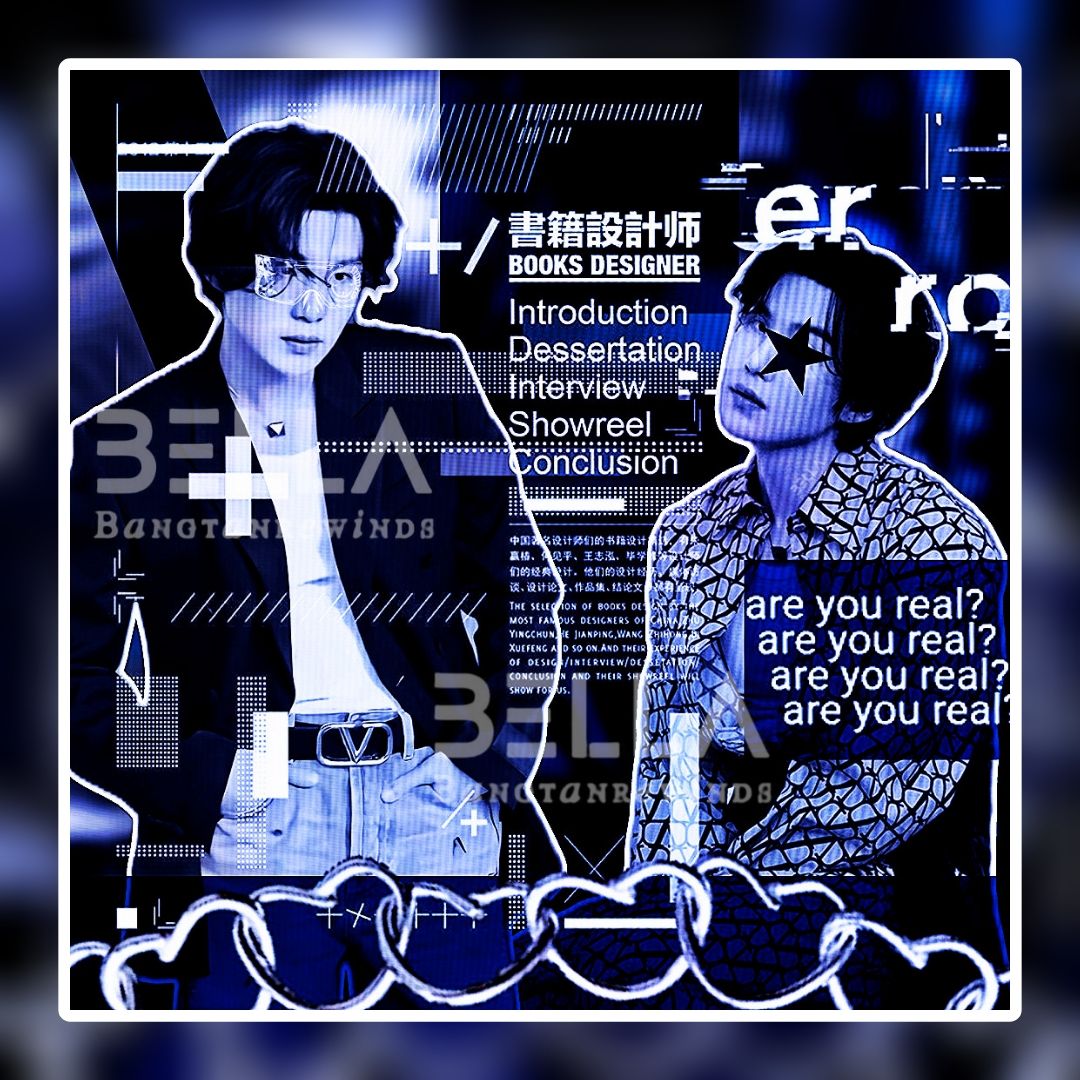
And now the face claim selection- it is preferred if the face claims are in different postures as I have used.
Now the main procedure.
Go to Picsart and choose your background.
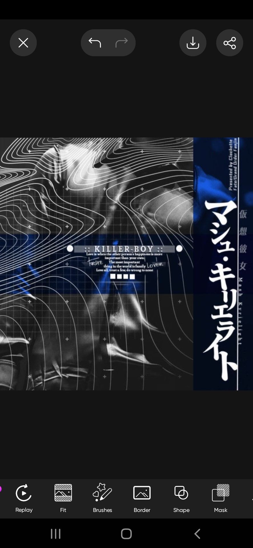
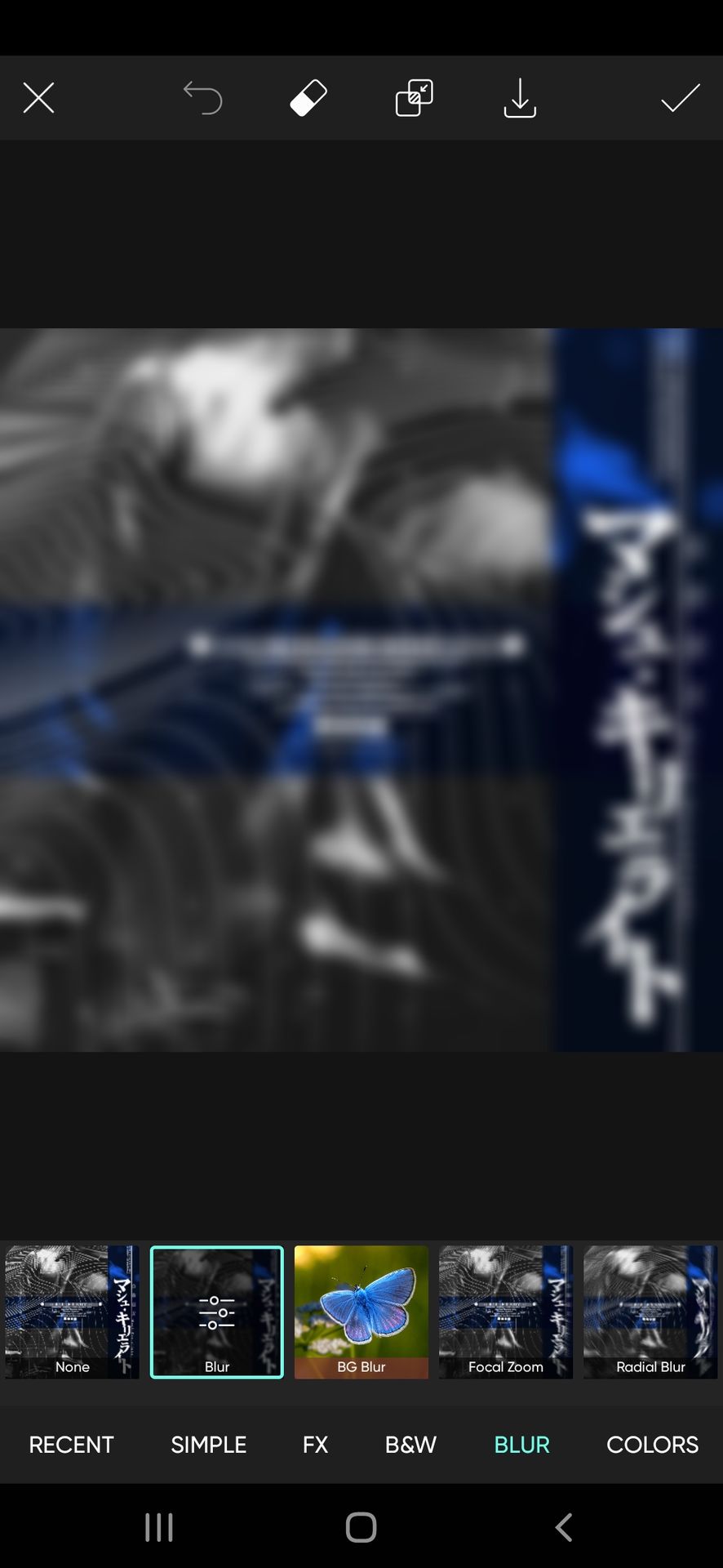
Go to the effects feature and blur the background.
Next up, select your face claim after removing its background.
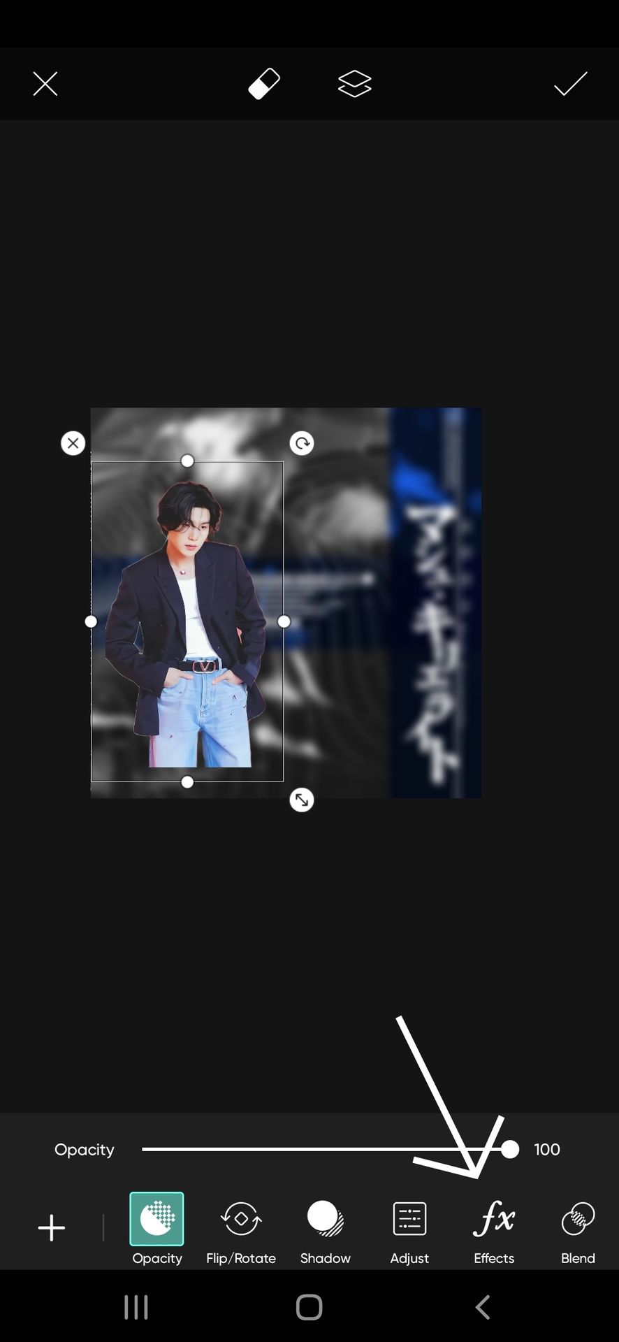
After choosing the face claim, go to the effects feature, the one I have marked with an arrow. You'll now have several effects features, go to b&w and choose any you feel is suitable. I chose this one.

Do the same for the second face claim picture we will be using. We have the face claims on the background, now we have to place them accordingly.
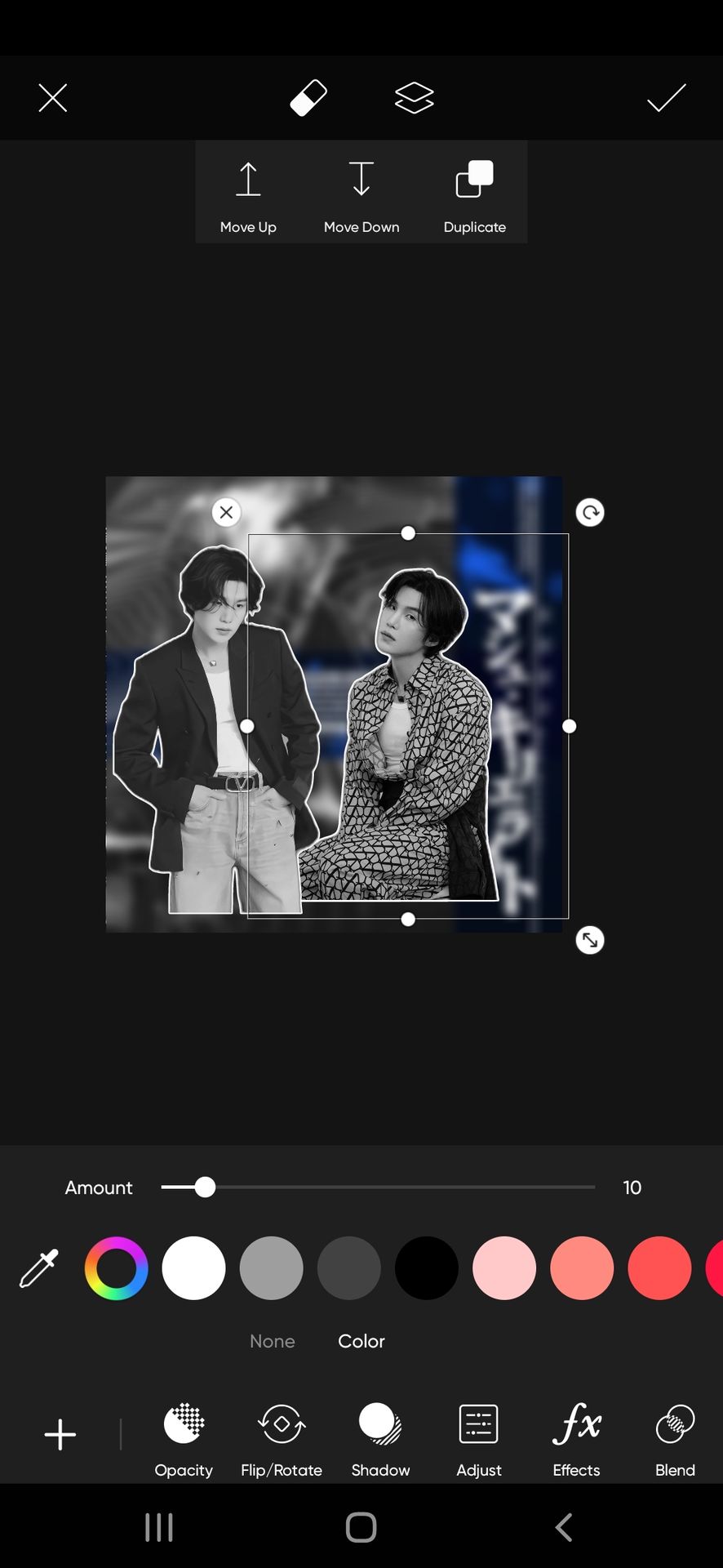
There are no strict rules for specific placement as it is minimalistic with only two face claims. But just make sure it covers a major part of the design and if using a white outline for the face claim, it doesn't look odd (as in looking like a cutout due to unfinished ends).
I placed it like this. Also, if the face claims are in different postures, do not place them evenly. Like in the same line.
Why? Due to different postures, the face claims may overlap with each other and we do not want that for a minimalist design.
So now we are done with the face claim work.
The overlays now!
Go to the shape feature I have marked and choose a rectangle shape from the simple section.


Use the colour of the shape as blue which is present in the background.
Change its blend mode to multiple. It is necessary to make sure the blue color stands out well even with the dark shades we are using and also so that the background is still visible.
You can place such stripes all over the background in whichever way you want. Just make sure it isn't placed on or behind the face claim. It covers the place with no face claim. I placed them like this.

I placed a star shape on Yoongi's eye, that's optional, you can skip it.
Now we have enough blue on the design. Next start adding overlays in white to balance the colors.
A major consideration while using the overlays in the minimal theme— If you are making a minimal edit but still want to cover a major space, then use overlays of a large size just like I will be doing now. It saves you from making the theme too complex and also not empty.
I'm using this large overlay.

Change its blending mode to screen and place it above the face claim
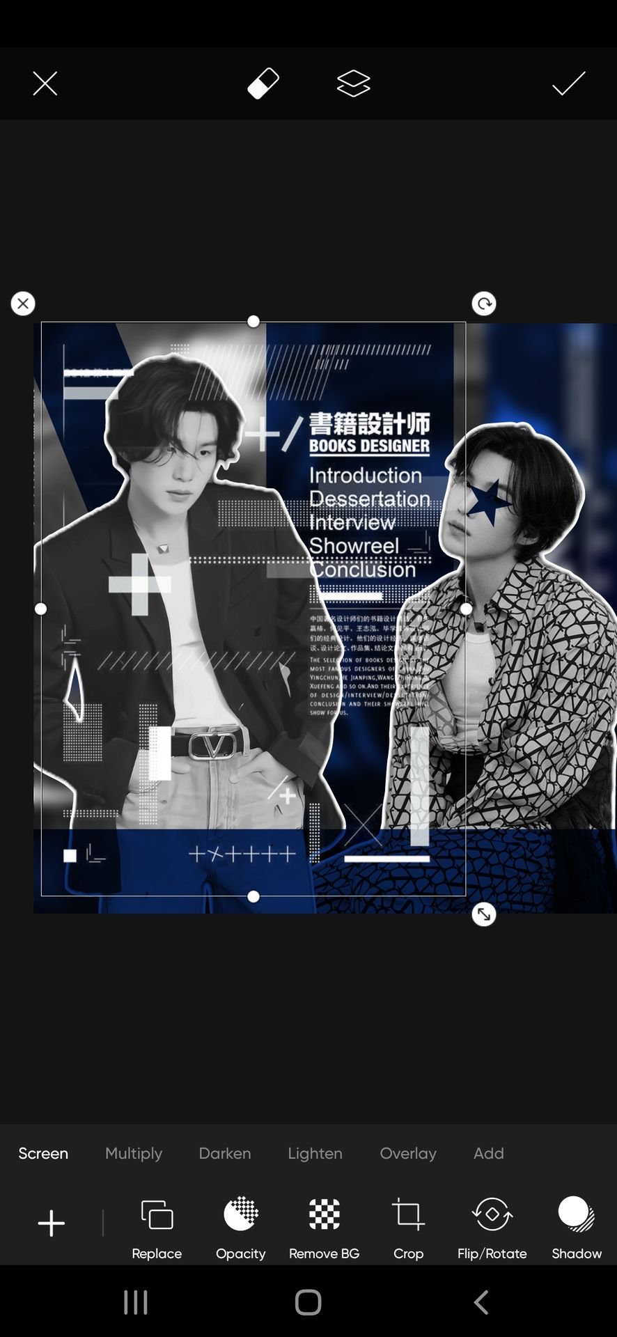
Why not behind the face claim? The same reason as above. To cover the design well with less overlay.
Now the right side and the bottom are empty.
For the right side, using white or black elements can overlap with the face claim. So I placed a blue square on a screen blend mode like this. Now that the issue is fixed, you can place any overlay over it. I'm placing this text overlay.
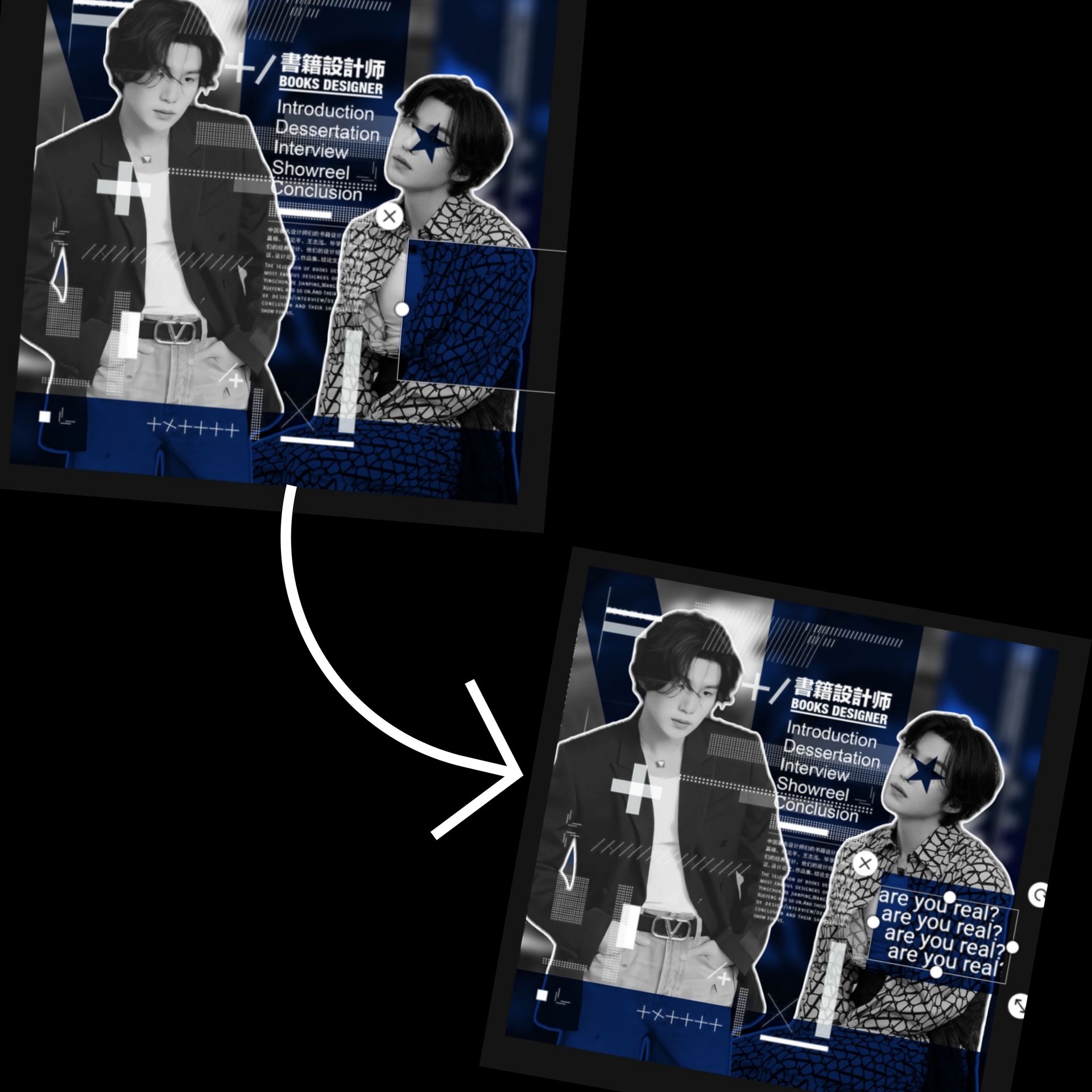
And next up, adding this overlay over the top right corner.
So the right area design is done.
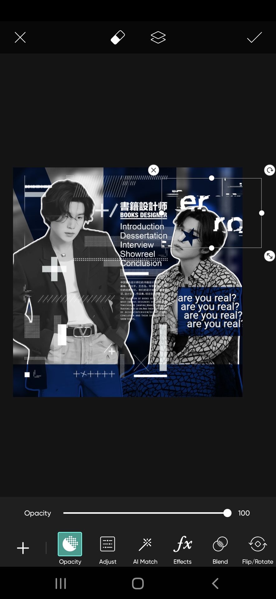
Now for the bottom, I'm adding a chain overlay. Don't want to add a text overlay. It will get too repetitive. And with other detailed overlays, it can get too overcrowded.
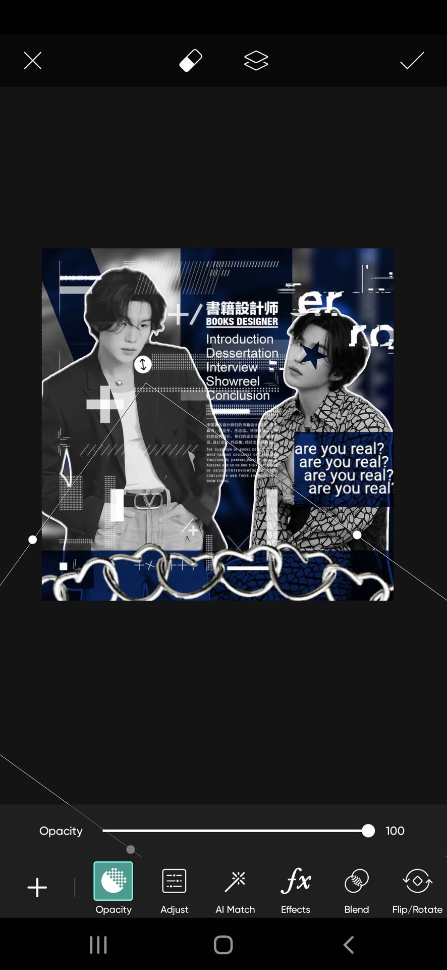
Done!
Lastly, I added these glasses on Yoongi's face. Again optional, but it is setting the right vibe of the theme 💃

And we are done!
Save the theme.
This doesn't end here. To give the final and most necessary touch, use a suitable filter.
Import the theme in the Polarr app and tap on the discover feature in the bottom left corner.

Go to the search bar at the top right corner.

Type the word cyber and scroll through the filters until you find the most suitable one for your theme (I'm using the first one). Tap on it.

Next, click on save and use the filter
It's done, the filter is added to your filter collection.
After adding the filter if you feel the design needs more editing, use the adjust feature.
The theme is finally done. Here is the outcome.

Next up is a tutorial for the comic theme of my theme shop's batch one order requested by lilmewomewo93
But that will take time. College started again and down with fever right now TT
Anyways, hope this tutorial helped ❤️
Bạn đang đọc truyện trên: Truyen2U.Com