× heavy typography ¹

This took longer than I planned, but we’re finally here!
In this chapter, I’ll show you how to create a heavy typography theme from scratch.
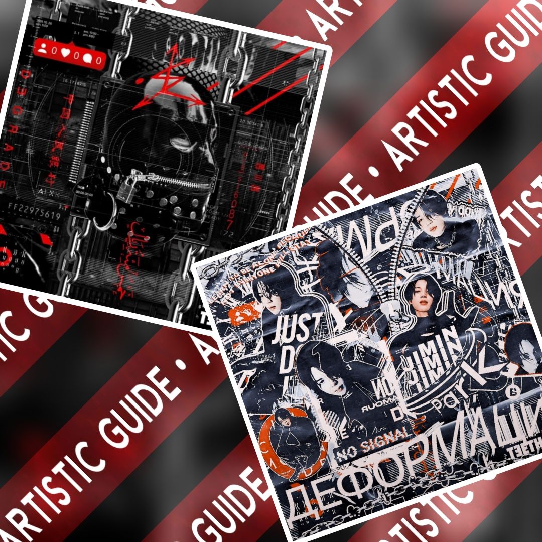
Before we get into the steps, here’s a quick look at the process—from a blank background with no typography to a complete, finished theme.
It might seem like a lot of work, and it is, but it’s worth the effort. This is the most time I’ve ever spent designing a theme because I wanted to build it from the ground up to better portray how typography works—and to help you do the same.
Let’s get started!
One important thing before we begin: use face claim pictures and overlays that face different directions—straight, inverted, and flowy. If you look at the resources I used you'll get an idea of the pattern I'm talking about.
Using images that all face the same way usually makes the theme look cluttered or off.
Now the steps!
To begin, open Picsart and choose the background you want to work with.
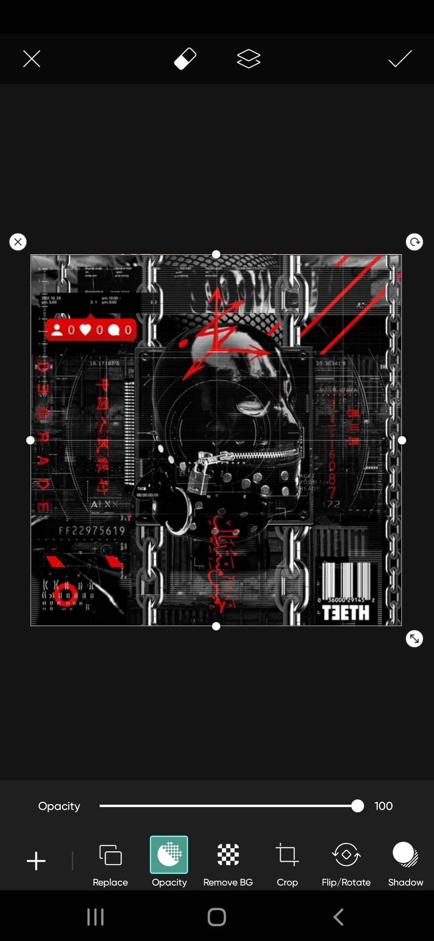
Now, when you are making a heavy typography theme, you may find it challenging to add typography in a way that won't look messy but also complements the style. To balance it all, start by placing a base full of typography over your original background. This helps in many ways. Especially to avoid adding too much text literally everywhere (':
But you must be careful while choosing the type of background. Because we just want to have a light typography spacious base not making it an entire base overshadowing other elements.
So choose a typography background with spread text like this. The words are not nearer but extended enough to cover the full background.
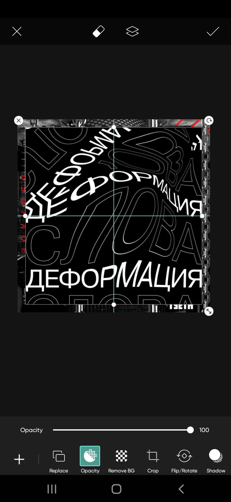
Then change the blend mode of the text base to screen so that the main base is visible alongside the text. The outcome will appear like this.

Our base is ready. Now let's start by placing all elements.
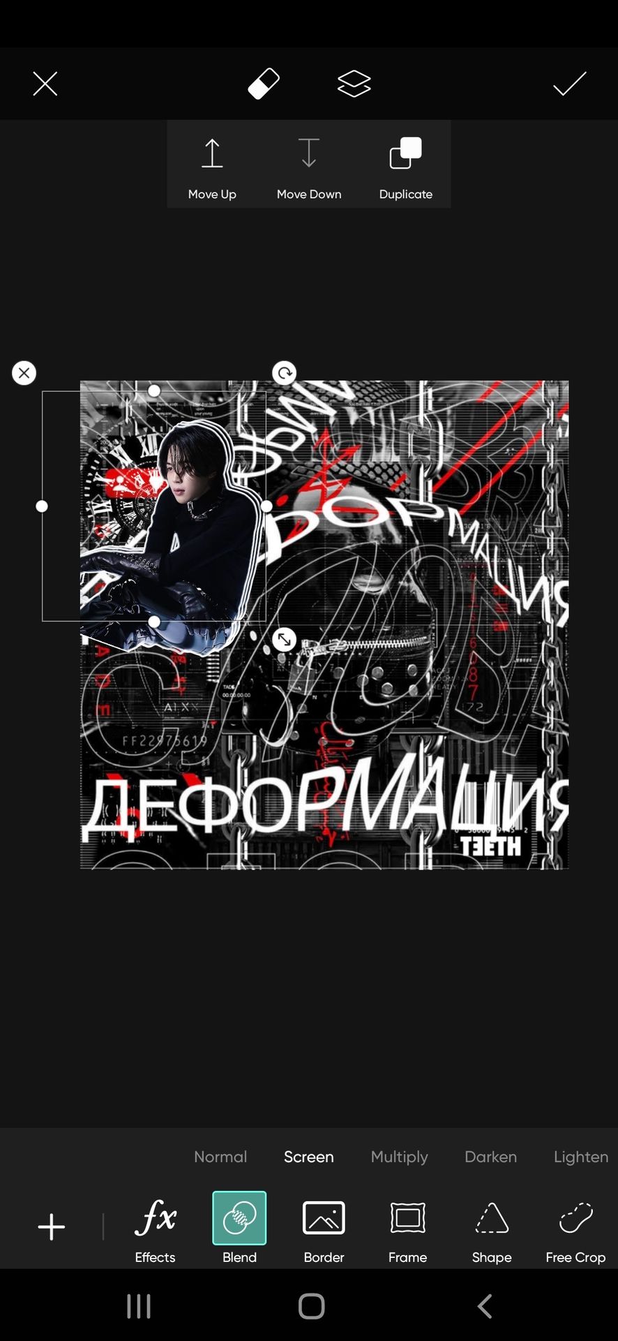
But before that, let us mark the places in the background to which we will have to add face claims, for no confusion.

Select the face claim picture and add a white outline to it by choosing the option border I pointed out.

Why did we didn't we start by placing the face claim at the centre?
In complex themes, the positioning of the face claim is the most challenging and important part.
Never start with center placement, especially in themes with heavy overlays. This is because, if the placement of face claims is central axis. They will cover most of the central region and you may not be able to add text overlays evenly. If you add overlays on all the faces claim it may look too much. Having no choice you may have to add the text overlays around the face claim making it look uneven.
It went too long lol. But all in all, start from random positions around the center.
This part is optional but it can help elevate the face claim in a theme full of elements. Once you place the face claim. Duplicate it using the duplicate feature available at the top of the screen.
Now add it in alignment with the right to the face claim. I added two duplicates like this. So it is three-layered now.

It will look like this. Doesn't it look a little segregated and elevated from the background now?
Again, an optional choice, I felt the background behind Jimin looked a little empty so I added a clock overlay behind him. But you can avoid it.
Never forget the goal. A heavy text theme. Whenever you place a full-body face claim, it can cover a major space. So place a text over it to fix the error.
A trick again (too many considerations by now, I know TT)
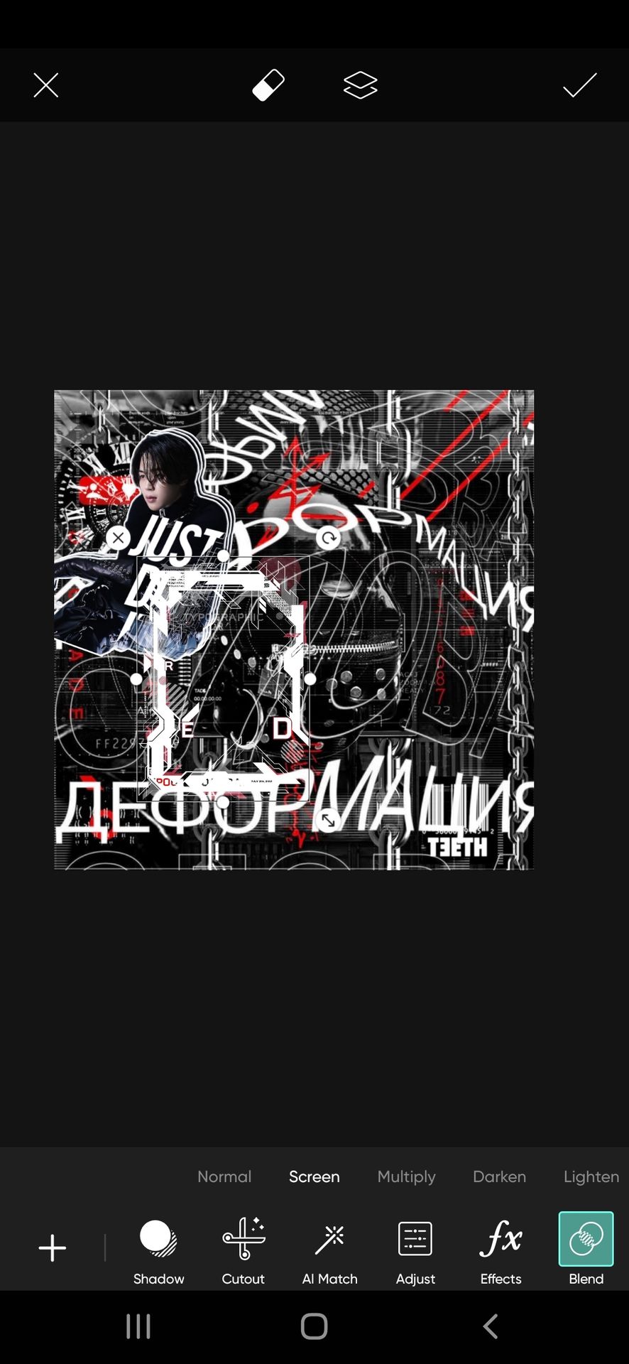
So, look at Jimin's body posture. A straight text overlay can overlap the text base or look messy on Jimin. So choose an overlay that aligns with his posture like I did here. Erase the text coming out of the face claim. This helps in keeping it clean.

Add more face claims in the areas I marked.
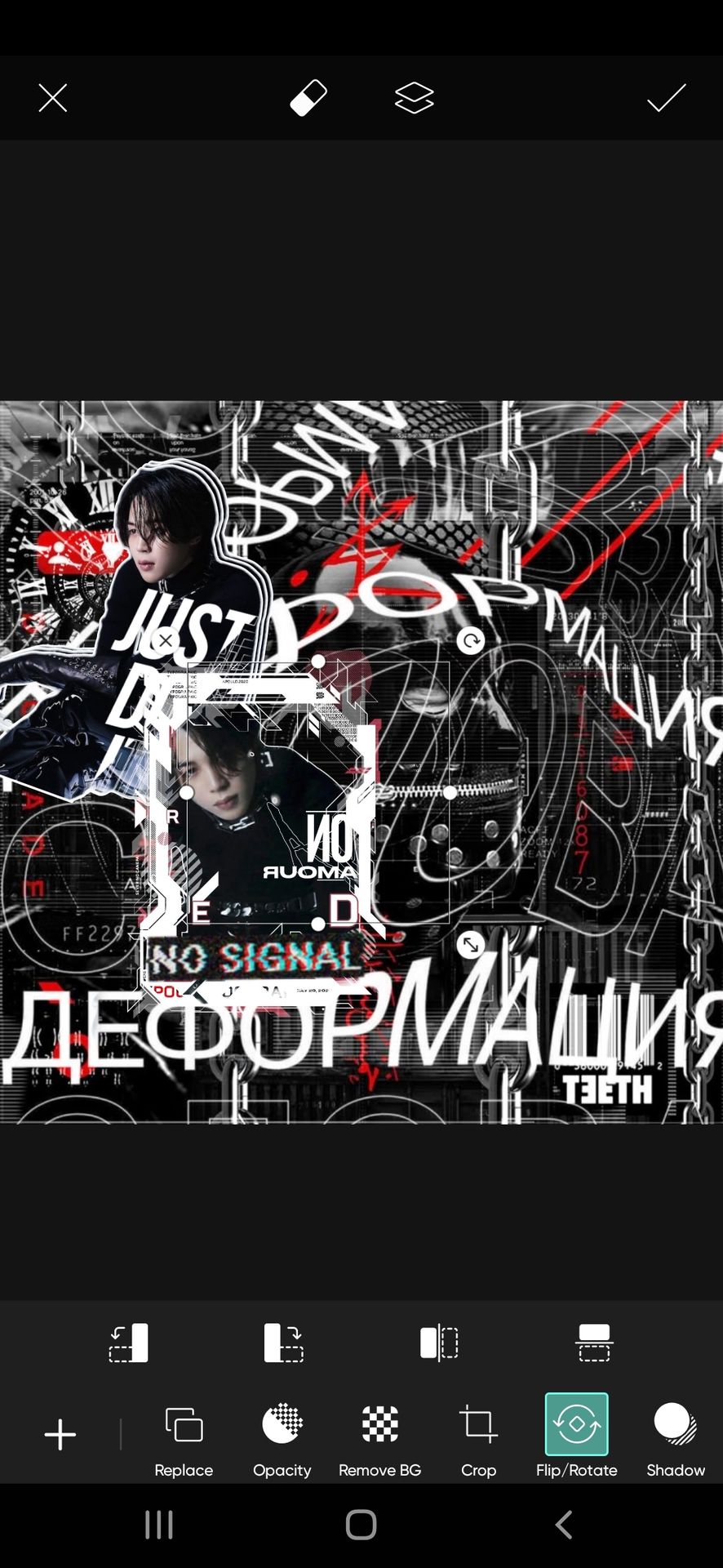
One more trick under my sleeve 💃 do not add all face claims just like the one I placed now. Use frames so that there is diversity and the face claim is eye-catching and doesn't get too blended with the background.
So first place a frame of your choice anywhere you feel suitable. Like this.
I know I told you to do random placements, but that's just not to follow the rigid centre, right, left, bottom, and top placements. But be careful to place them in a way that at least half of them are touching one another a little. You can observe me doing the same in the outcome theme I have added above.
Now, place your face claim into the frame and erase the edges coming out of the frame using the eraser feature on the top of the screen.

Again, the face claim is large. So let's add some text again. The ritual follows- observe the posture, it's straight. So we are good to add the text in the same way. I added this text on Jimin here.

You can stop this frame text design here. But I wanted it to be more complex, so I'm adding this text too.
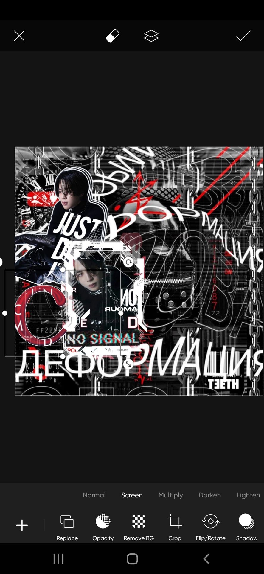
Now, the last place from the left is to be filled. Look at how much space you have left.
It is less.
So adding either a cutout or a frame would suffice. But with a good coincidence of the text base we have a big C at the last face claim spot. Let's use it innovatively. This can also contribute to adding a different dimension.
Add your face claim

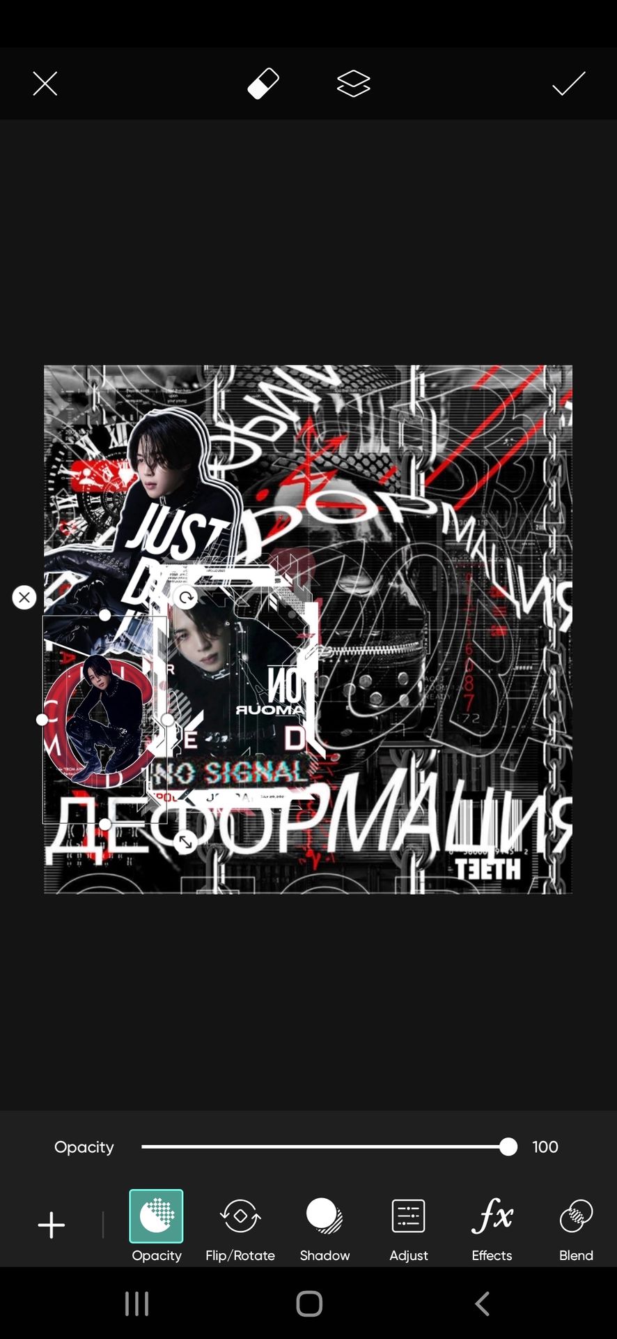
But doesn't it look too plain?
Also, as I have always told in all of my tutorials, an even spread of colors is much appreciated. If not that, at least make sure the same colors don't overlap more.
So I will use an overlay of the letter C in red color here.
Now add your face claim on the letter C. As if the face claim is seated on it.
I was almost reaching the image limit at this point TT
But half of the theme is still yet to be designed.
This tutorial is continued in the next chapter. Do read the whole mechanism for better understanding

Bạn đang đọc truyện trên: Truyen2U.Com