× heavy typography ²

Now the other half of the theme to be done.
Let us start with the right axis. We have three places to fill. I'll start with the middle one. You can choose any way.
Again, two duplicates. Making it three-layered like this. I have erased the bottom of the face claim to fit the overlay I'm adding over it. If I erase it later with so many layers, it can get too difficult.

As I said, in typography theme, do not leave a full-length face claim plain. So I will add an element around it.
Why not add a text directly?
The theme will get repetitive. Always a face claim with text-
Nah!
So I'm adding this overlay.

Now we are good to add a text too. I have added Jimin’s name here. A sticker from Picsart itself.

Looking at the theme now, I feel we can add a tiny text below the sphere frame as well.
Maybe a park would go well there, completing Jimin's name :D
Again, adding it in a direction that feels like the words are hanging off the sphere frame.

How did I do it?
Text > type the word you want > select your desired font style > use the feature perspective to change the dimension of the text as you wish.
The only problem is that this feature is premium. You can search on Pinterest for hanging text if this feature is unavailable.
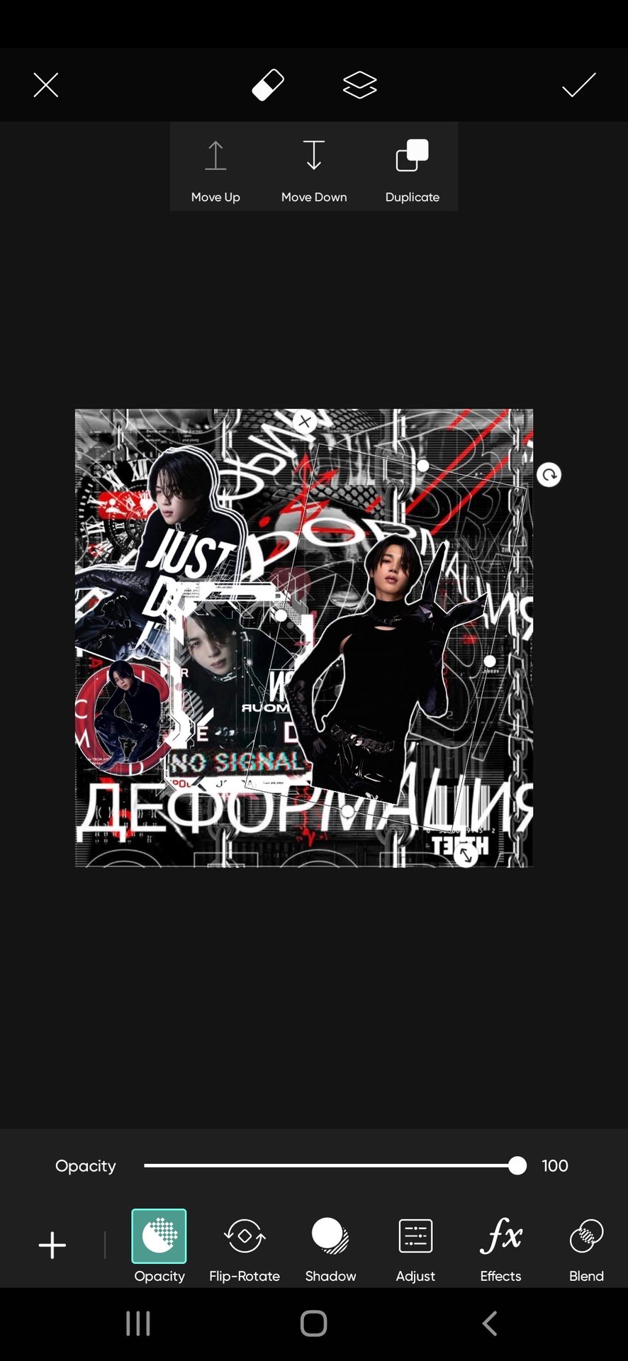
Next up, filling the second spot on the right axis- beside the one which I added recently. Looking at the theme now, adding a frame to put on the face claim is suitable.
How?
We have less space, so we can't add the full body of the face claim. And just the cutout of half a body would look odd. So a frame it is.

Now add your face claims cutout into it.

Done!
last two left ufff!
Not going for centre again, so the top right one it is.
But doesn't the spot look too spacious? So we are adding an outline again. Look for spacious frames. I used this one. It gives a good elevated effect to the face claim while filling the major space.

But now we will have to figure out how to place the face claim into it. A direct placement would look odd like this.

Why the oddness? Because this particular element looks dull when compared to the other elements of the theme. So let us add an outlining frame like this.

Finally, we are left with only one spot.
But doesn't the space look too zig-zag for a face claim placement? Imagine fitting a zig-zag face claim to accommodate the space.
This reminded me of all those crazy photo shopped memes
Lol XD
So we find a decent way :D
We have two crises now, a lot of space without any elements or a face claim. We need to incorporate both.
A face claim with text on it?
Nooo! The place is less for a full-length face claim, so a text on a cutout will look bad.
First, let's pick a focused picture of the face claim (I chose the same pic of Jimin I used earlier, there was no other intense and focused picture than this)

Then go to the feature cut out> shapes.
Choose any shape you like. I'm going with this.
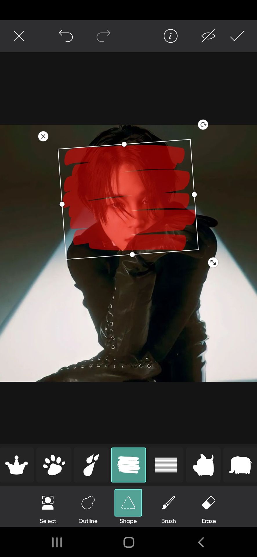
Why not a normal cutout like the other face claims in the theme?
First of all, I wanted to cover major space but didn't want to overshadow the text behind. So such a design can help with both. Of course, it does cover a few texts, but not like how a major frame design would.
I changed Jimin's picture to a grey shade. If you noticed, I didn't remove the background of it and the background color wasn't going well with the other stuff there.
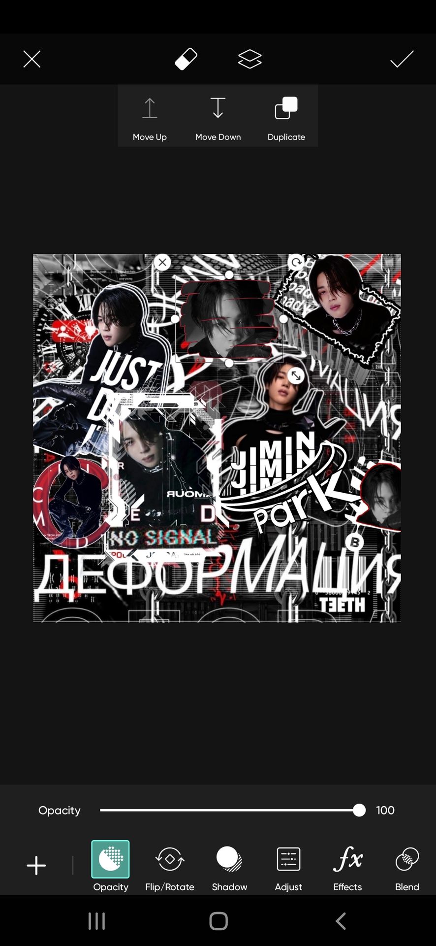
The face claim placement is finally over. But the space between the two faces claims at the top right looks unfinished and the extreme centre space too.
No text can go in-between.
Neither the face claim.
So an overlay it is.
If you ever get stuck like this, do not worry yourself over finding texts, which will take a lot of time. Better fix it with any element.
I'm choosing this zipper.
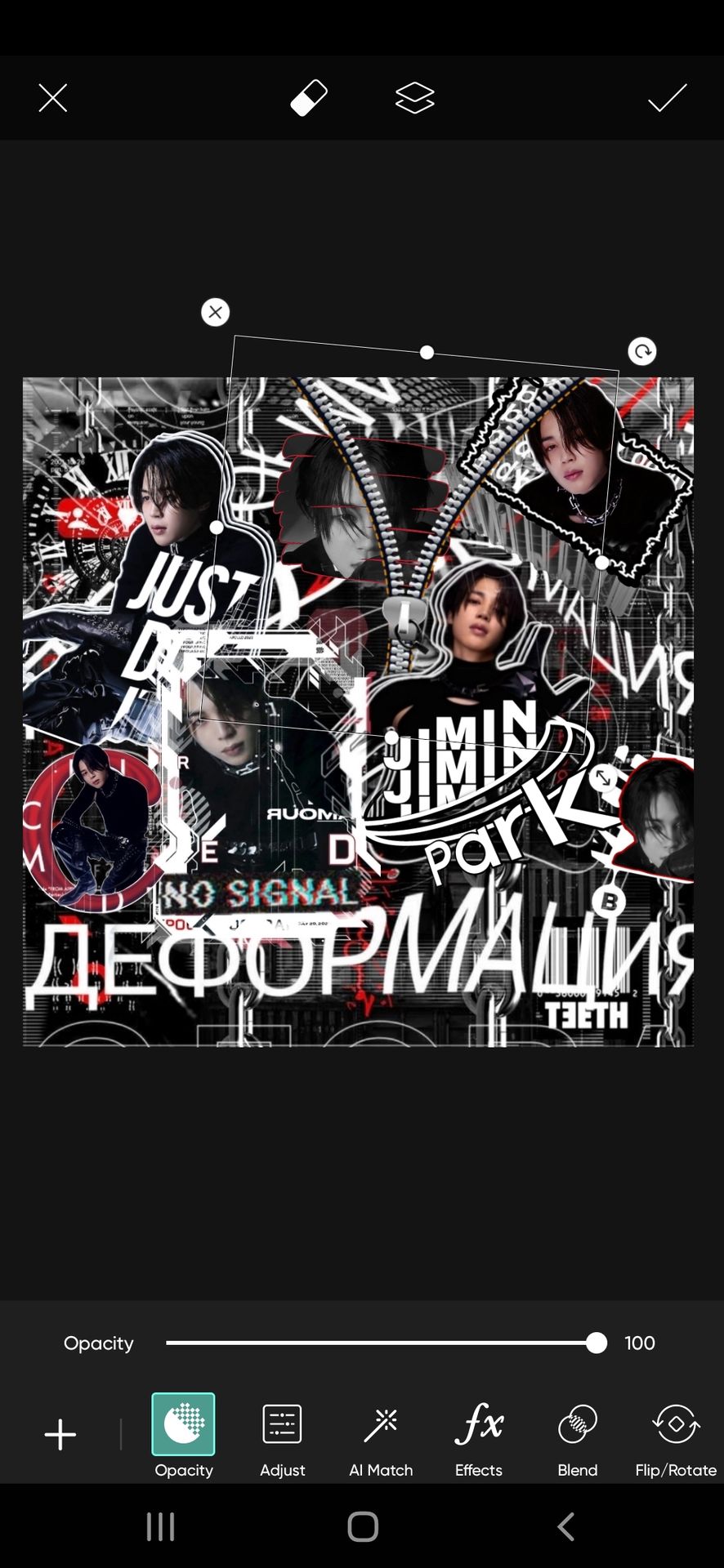
Now we shall fix the no-text error in this spot. Take the background of the theme and add it inside the zipper like this.

Now erase its edges. And we are done.

We are at the last step now.
Look for any empty places. If any area looks dull or without text.
I could spot the top left corner and at the bottom of my theme like that. So start adding elements of your choice there.
I added these, in the same order.

And after so much reading and killing of brain cells, we are done XD
These are the filtered versions I made.

This theme is available as a giveaway, you can claim it. The rules are simple— follow me, announce this book on your message board, and give credit in your bio.
I hope the chapter was helpful!

The request page is open. Don't hesitate to reach out ❤️
Bạn đang đọc truyện trên: Truyen2U.Com