× single face claim theme tutorial ²
Let's continue the same style but with another pattern.
A color mania theme. This is the first time I'm trying this pattern honestly. It uses minimal to no elements which we usually use in theme designing. When you are tired of finding new elements, maybe go for this one.
Sometimes knew?
Let's get it!
As a ritual to follow, open a blank canvas on Picsart.
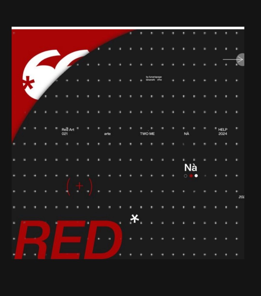
Then place any background you want. But make sure it has a minimalistic design on it. Do not use a complex background. I'm using this one ↓

Then go to the sticker section and search dots like I did below and choose the tiniest ones.
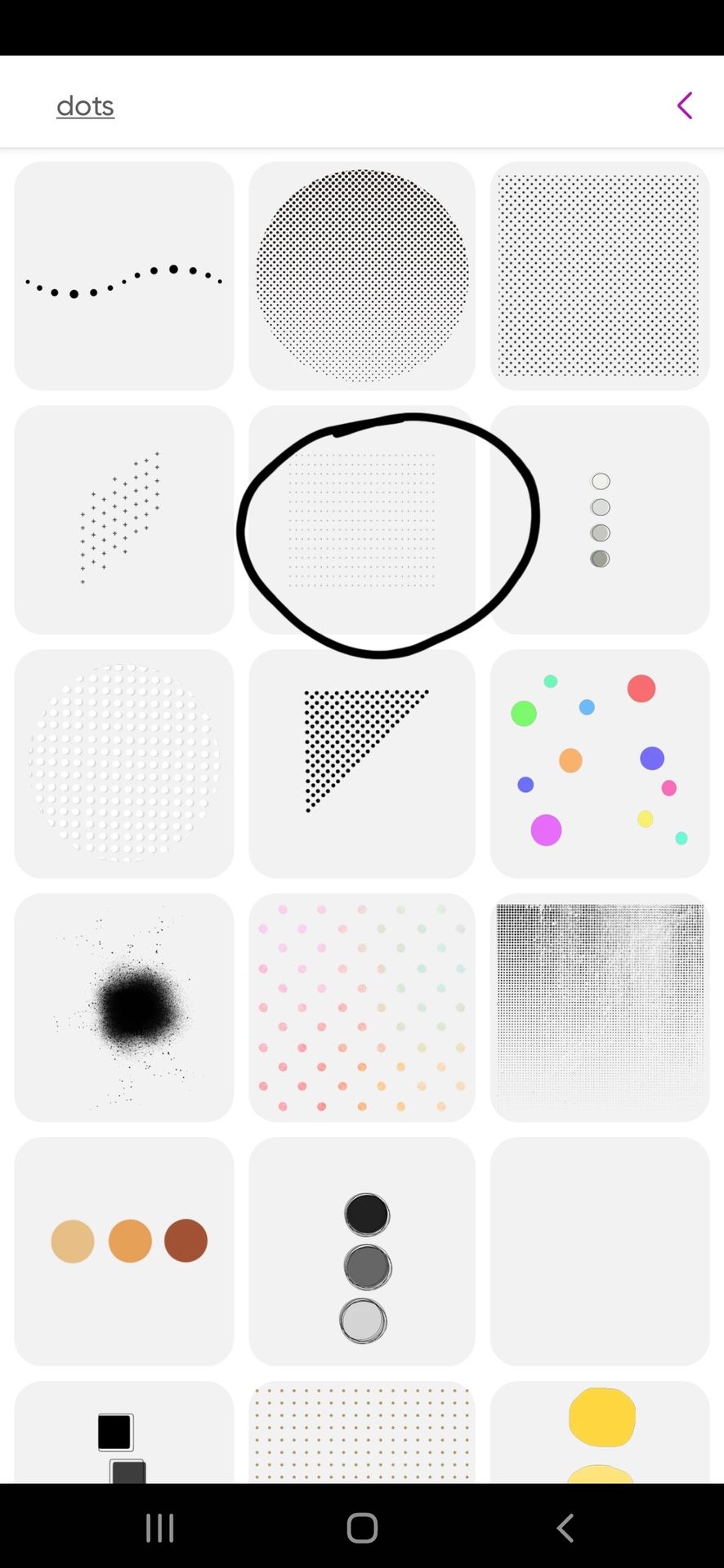
And then place them over the whole background. I'm erasing them from the red part so that it doesn't overshadow the design.
It will look like this. Then place your face claim. You can place them anywhere in the background, unlike the last tutorial. Regardless I'm going with the centre placing.
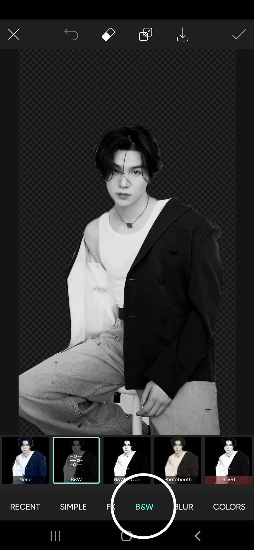
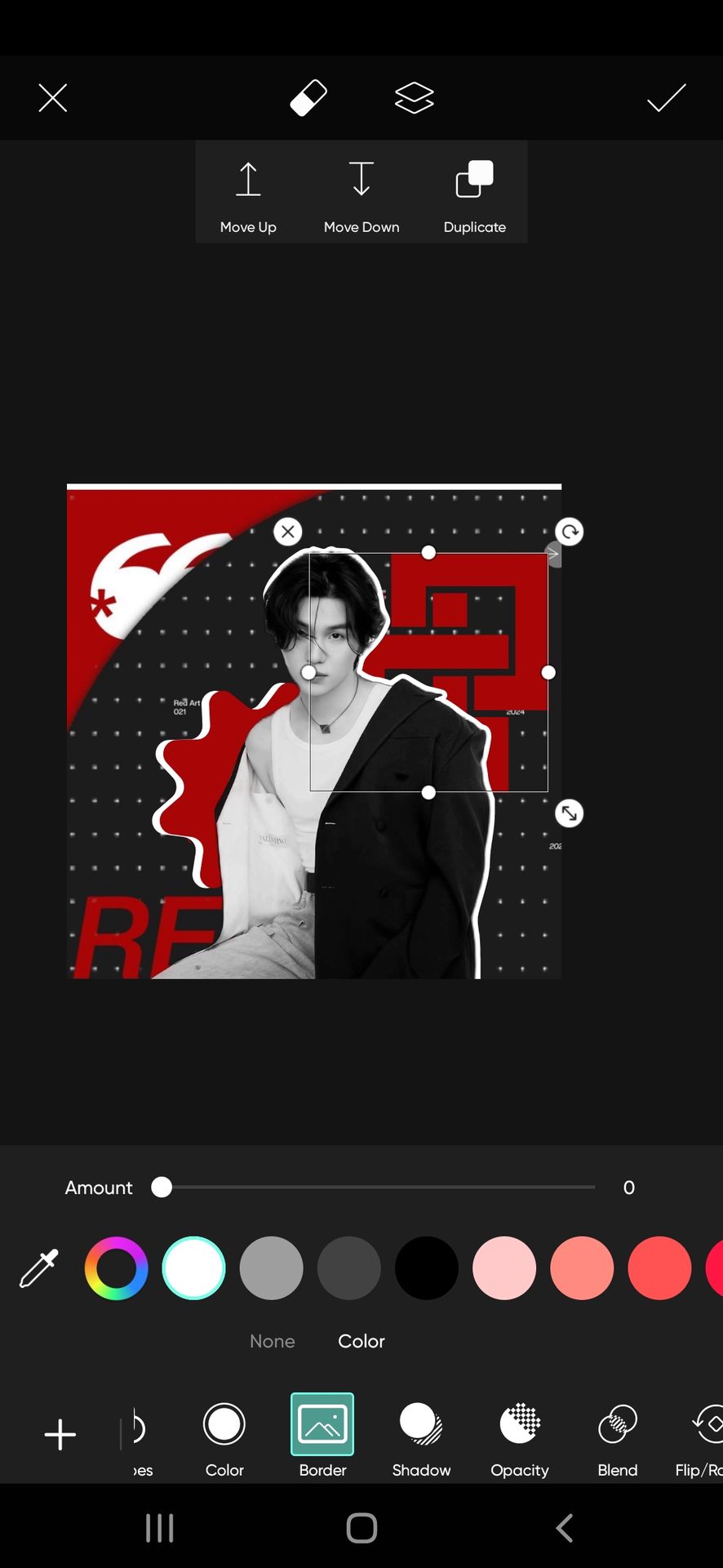
Once you select the face claim picture go to the effects option and apply the B&W filter to the face claim.

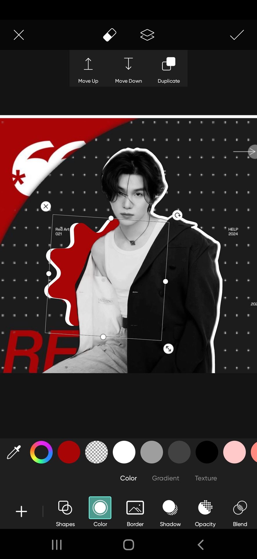
Next up add a white outline to Yoongi.


Now the magic begins.
Go to the shape feature at the bottom of the screen.
You'll find several shapes.
Let us start with filling the space around Yoongi. First behind him and then above him.
Tricks to be followed for the color mania theme
• use the colors in 2:2:1. The one I'm using- is in the same order (black: red: white).
• use a 2d outline for every element, to give an elevated effect.
• use spacious shapes to fill the space behind Yoongi
• Use small or outlining shapes to fill the space upon the face claim.
• use sharpening filters to bring out the best of the theme.
• stick to the colors decided and most preferably background colors for the elements.
Let us break down the design into three parts to make it simple.
1) Background elements
In shapes, go to the sale section and choose any pattern you wish. Just below the shapes column, you will see more features you could use to modify the pattern to your liking. We would most likely only need the color option. I'm going for a white color. Now click on the move-down feature to place the shape under the face claim.
Optional: you can place all background elements first and then the face claim but I would suggest this for more efficiency. Your placements won't go wrong this way. And you do not have to change anything later if the face claim overshadows any crucial element.

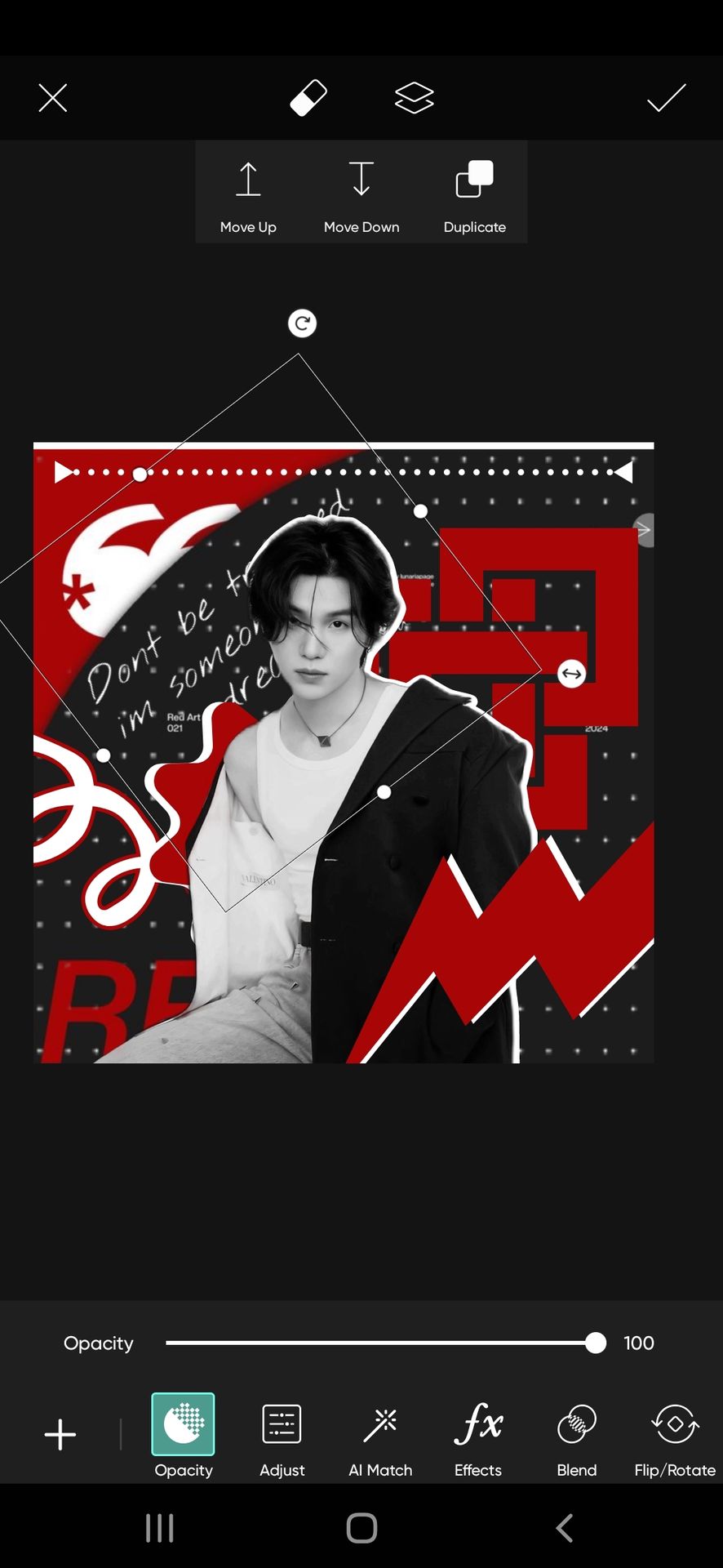
Now select the shape and click on the Duplicate feature on the top left of the screen. You will get another same white pattern, change its color to red- place it exactly on the white one, and then slightly shift it to the right side to get a 2d effect.
Now the next one, follow the same drill. The shape I'm using is from other section.
 f you see,
As you can see, I did not use the white outline here. That is because the element is an inward closed-up design, and the outline will cover the insides completely disrupting the design.
2) Hovering elements
Same procedure as background elements. For this one, I went with the arrow element from shapes. Adding a 2d outline can be optional when using miniature elements.

Then, shape > others > zig-zag (white color), and place it to the bottom right.

Add 2d outline >

Again, shape > others > spiral > place it to the bottom left with an outline.

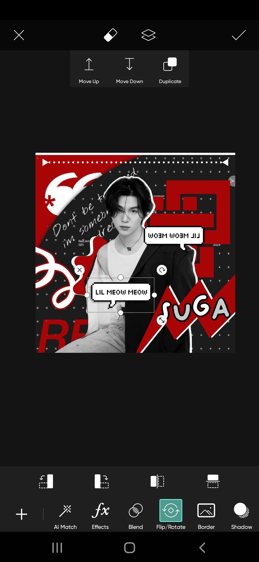
3) pngs (overlays)
Now add the overlays from either the sticker feature of Picsart or Pinterest.
The one I used from PicsArt ↓

And this is how I placed them

And we are done.

The one question you might have. How to know what to place where?
Remember three simple things,
• Add the elements that are in different colors than the background and face claim with a white outline.
• Make sure no elements overlap and are spread evenly. Like I did.
• For an easy beginning, each corner with one element which is top left, top right, bottom left, and bottom right. But making sure all elements touch the face claim.
I hope no doubts remain about this.
After saving your edit, go to Polarr and add the filters you wish. Try sharpening the theme. You can find them by searching sharpen in discover section of polarr.
After adding your filter, add the one I mentioned.
I made two versions >

Hope this was helpful. This one was longer and took time to make and write. With so many pictures, couldn't even add the banner of this book :')
Anyway, the next one is about how to find good backgrounds, elements, and all the resources you need to make a theme. Do share the book with others if you like it ❤️
Bạn đang đọc truyện trên: Truyen2U.Com