⌗ r.esults

❝who is the winner?

ᶻ 𝗓 𐰁 Let's dive into the battlefield and celebrate for the victorious .ᐟ
Review ::
⟡ Originality:: 14/15
⟡ Creativity:: 14.5/15
⟡ Elemental use:: 8.5/10
⟡ Quality: 10/10
⟡ Prompt relevance:: 14.5/20
⟡ Punctuality:: 10/10
Total:: 71.5/80
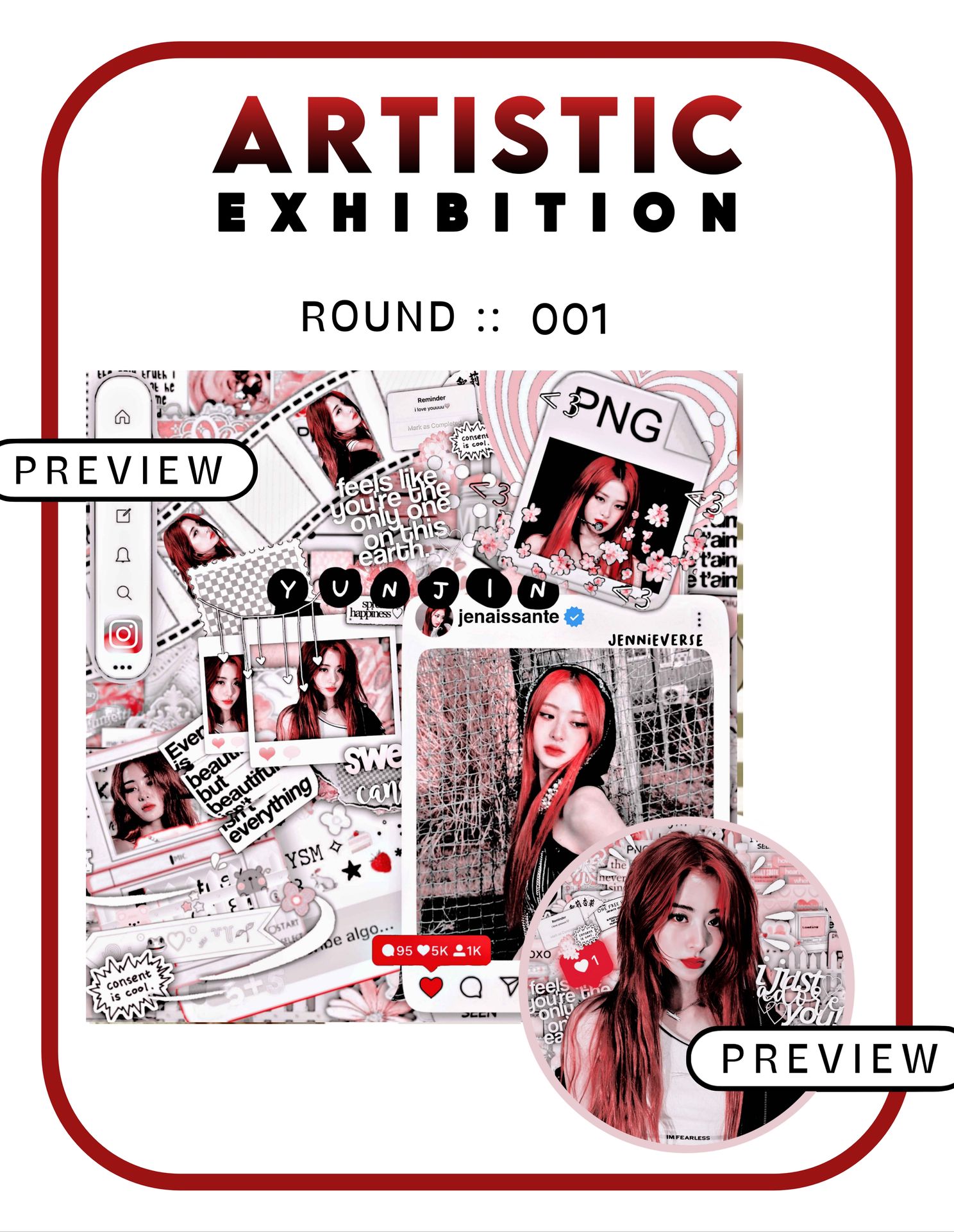
Starting with the concept. I loved the fusion between social media-inspired overlays and complex manip which created a mesmerising design overall. But the complexity of the design is overshadowing the social media concept of the theme a little.
The colour selection without a doubt enhances the features.The idol's name here as well is written in a unique and concept-intrusive way. Two marks will be deducted for the use of more face claims than 3. The icon has a perfect face claim’s posture and border. The impressive part is how there is more use of elements yet it doesn't look crowded. The placement was the chef's kiss.
Overall, the theme is attractive and aesthetically pleasing. The only advice will be to stick to the prompt criteria.
2. AraBTS07
Review ::
⟡ Originality:: 12/15
⟡ Creativity:: 12.5/15
⟡ Elemental use:: 9/10
⟡ Quality: 8/10
⟡ Prompt relevance:: 20/20
⟡ Punctuality:: 10/10
Total:: 71.5/80
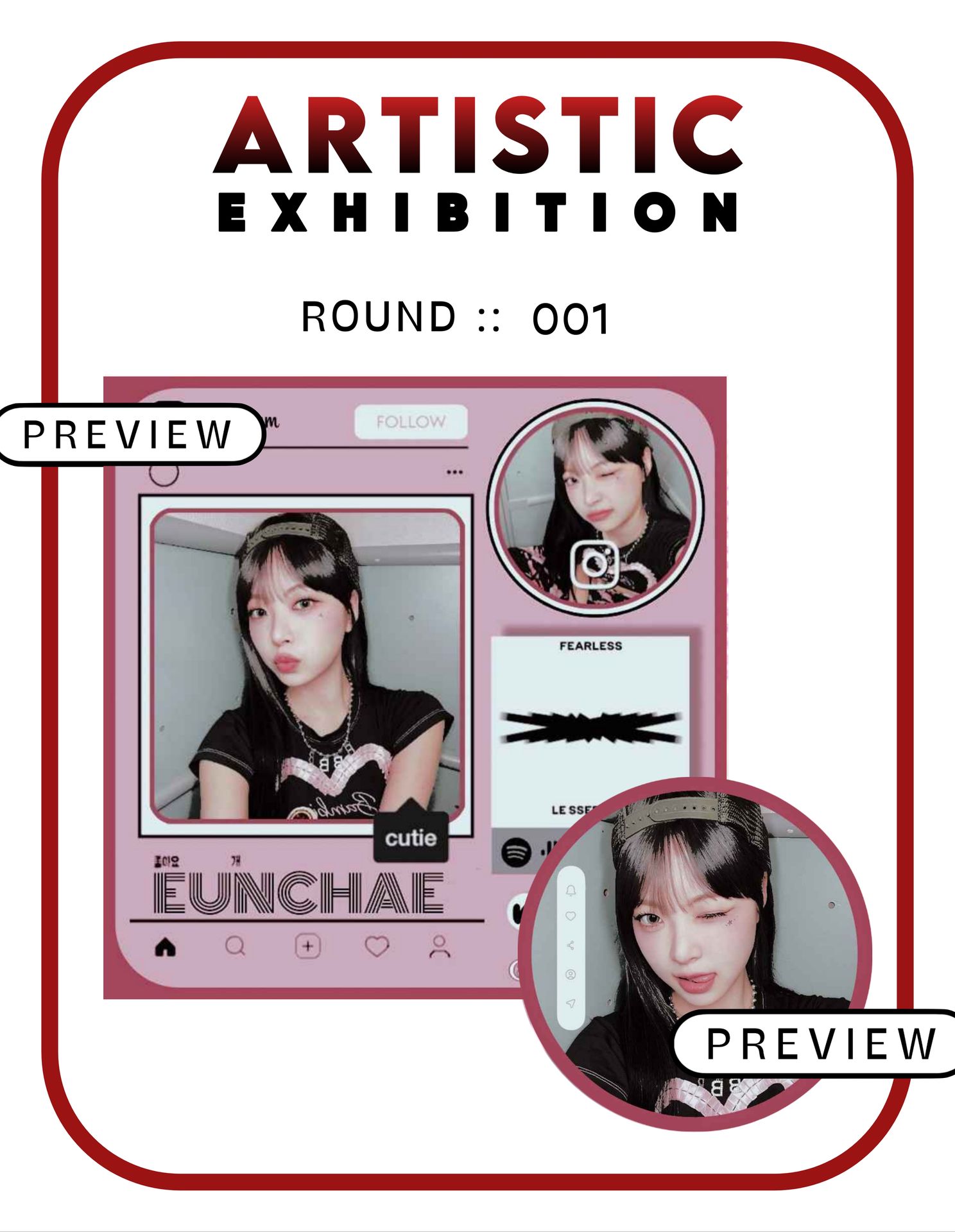
It's really impressive how well the theme aligns with the prompt — every detail, Hatts off. It reflects well the social media-inspired concept. This is one of the best themes out of all others which strictly follows the solid colour scheme which is outstanding.
Eunchae on the right in a circle border with the Instagram icon serves as a profile picture adding a unique touch and relevance. Eunchae's name is also intrusive to the concept of the theme. Though the face claims seem a bit unclear, especially the one in the circle. Also the background overlay could use a bit more decorative look or a different colour scheme could also help.
Overall, it's a perfect social media inspired theme which might need a little more aesthetic approach to enhance it to perfection.
3. esthvtic-
Review ::
⟡ Originality:: 13.5/15
⟡ Creativity:: 13/15
⟡ Elemental use:: 7/10
⟡ Quality: 9/10
⟡ Prompt relevance:: 16/20
⟡ Punctuality:: 10/10
Total:: 68.5/80
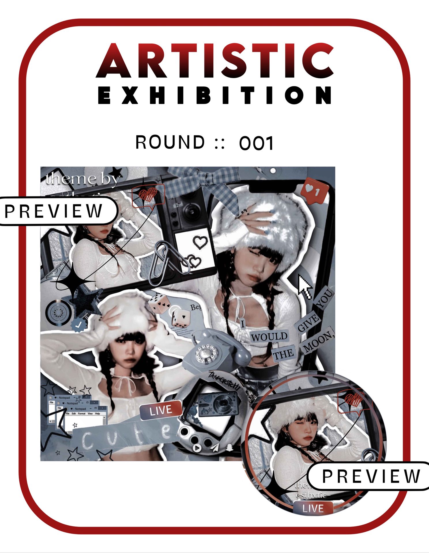
When I saw the theme, the first thing that captured my attention was the colour scheme. I liked how you have explored a distinct shade from others. Though I feel using any contrasting colour along with it will enrich it more.
The face claim- one of the best ones selected for stylish appearance among all themes, impressive! The distinctive use of elements adds up more to the creativity. Though they seem a little cluttered, especially at the bottom. A cohesive placing of omitting a few might help.
Two marks will be deducted for not adding the face claim's name to it. The filter- it lifts up the theme so very well, detailing more the elements and face claim. Some areas seem blurry due to overlapping and uneven cutouts at places, though not that evident.
The icon as well goes well with the concept- like the idea of adding the "live" png at the bottom.
Overall, the theme is distinctive, requiring a bit of modifications in the elemental use.
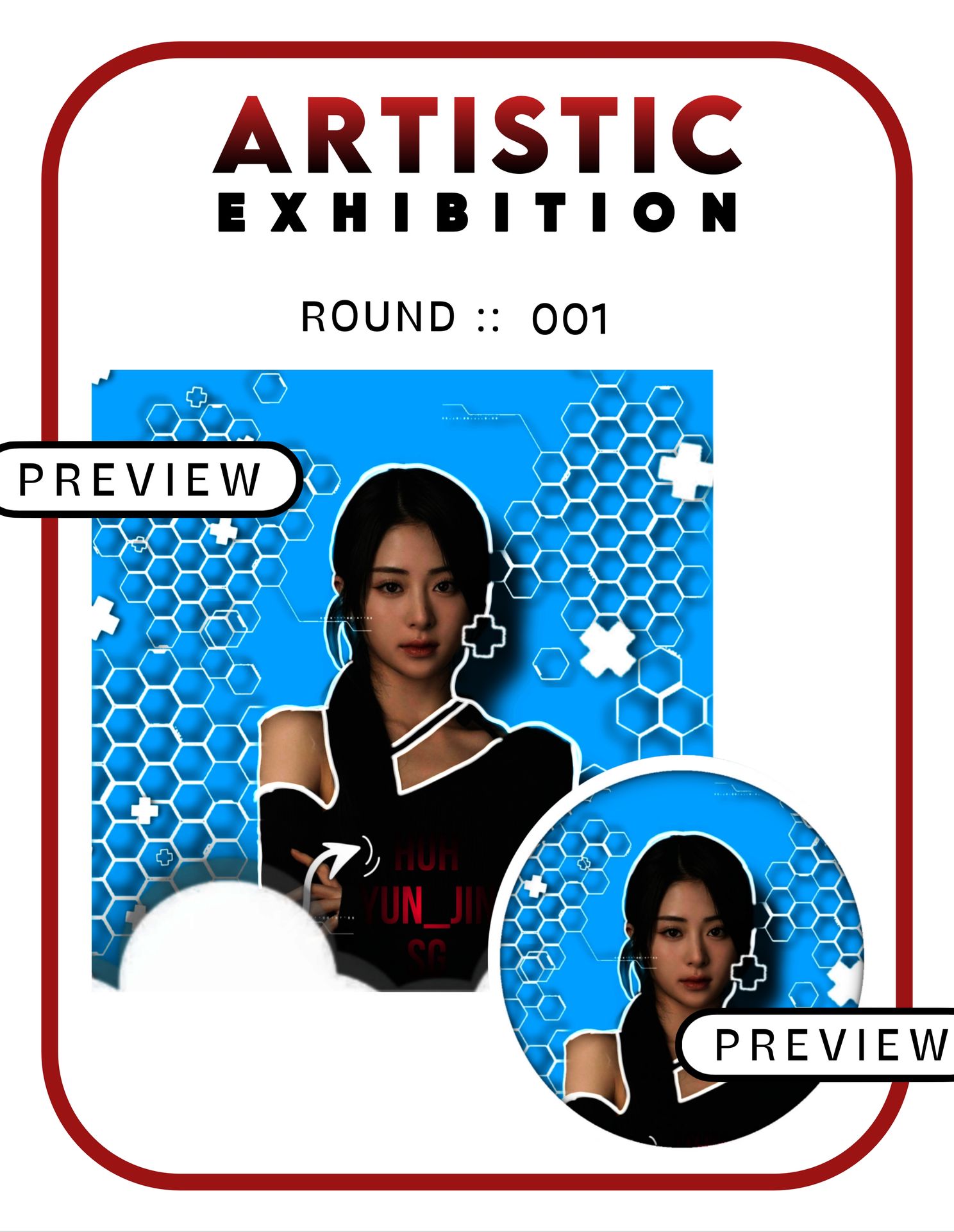
Review ::
⟡ Originality:: 12.5/15
⟡ Creativity:: 13/15
⟡ Elemental use:: 8/10
⟡ Quality: 9/10
⟡ Prompt relevance:: 15/20
⟡ Punctuality:: 10/10
Total:: 67.5/80
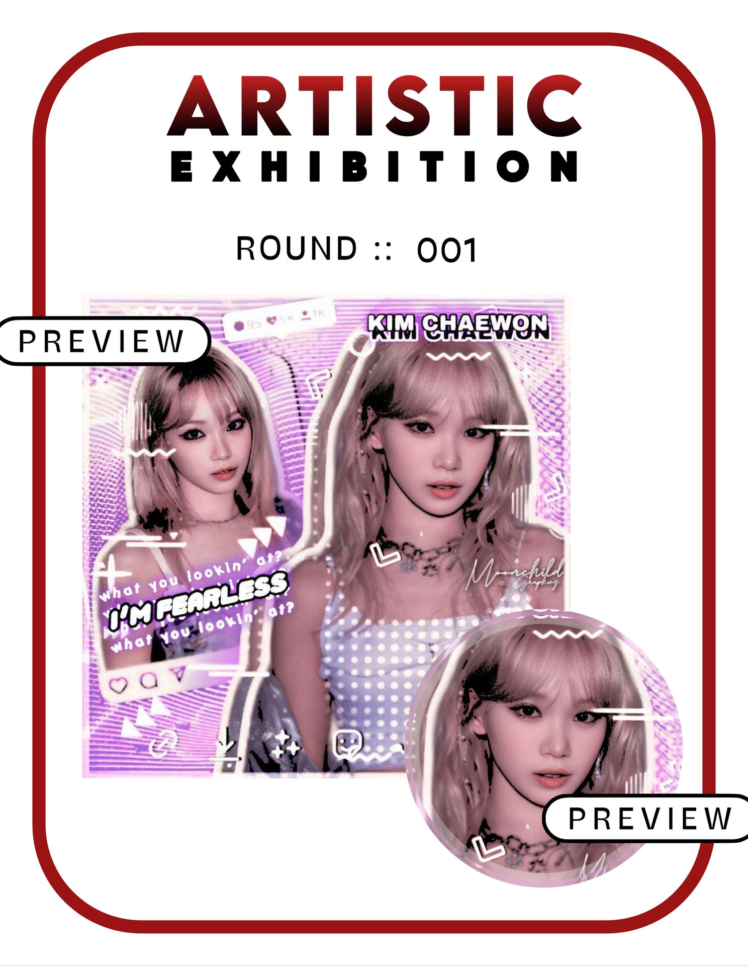
The theme takes a unique approach with a well-laid-out background featuring different white overlays. It follows most of the prompt requirements, with a minor deviation in the colour scheme. Instead of solid colours, it moves to pastel and gradient shades of lavender/purple, likely due to the more use of white in the background and higher brightness levels. Exploring some dark filters could help with this.
The placement of elements is excellent, with everything in its appropriate place, except for Chaewon's name. It could be more visually appealing if placed below and made slightly larger. The lyrics complement the theme's vibe well. The quality of the face claim is also outstanding, enhancing the overall appearance though some elements are blending in with the background or overlapping. While changing the blending mode of elements be careful that it's not overlapping with any other elements beneath.
Overall, the theme is eye-catching and clearly social media-inspired, with the only deviation being in the colour scheme and a few modifications in placements.
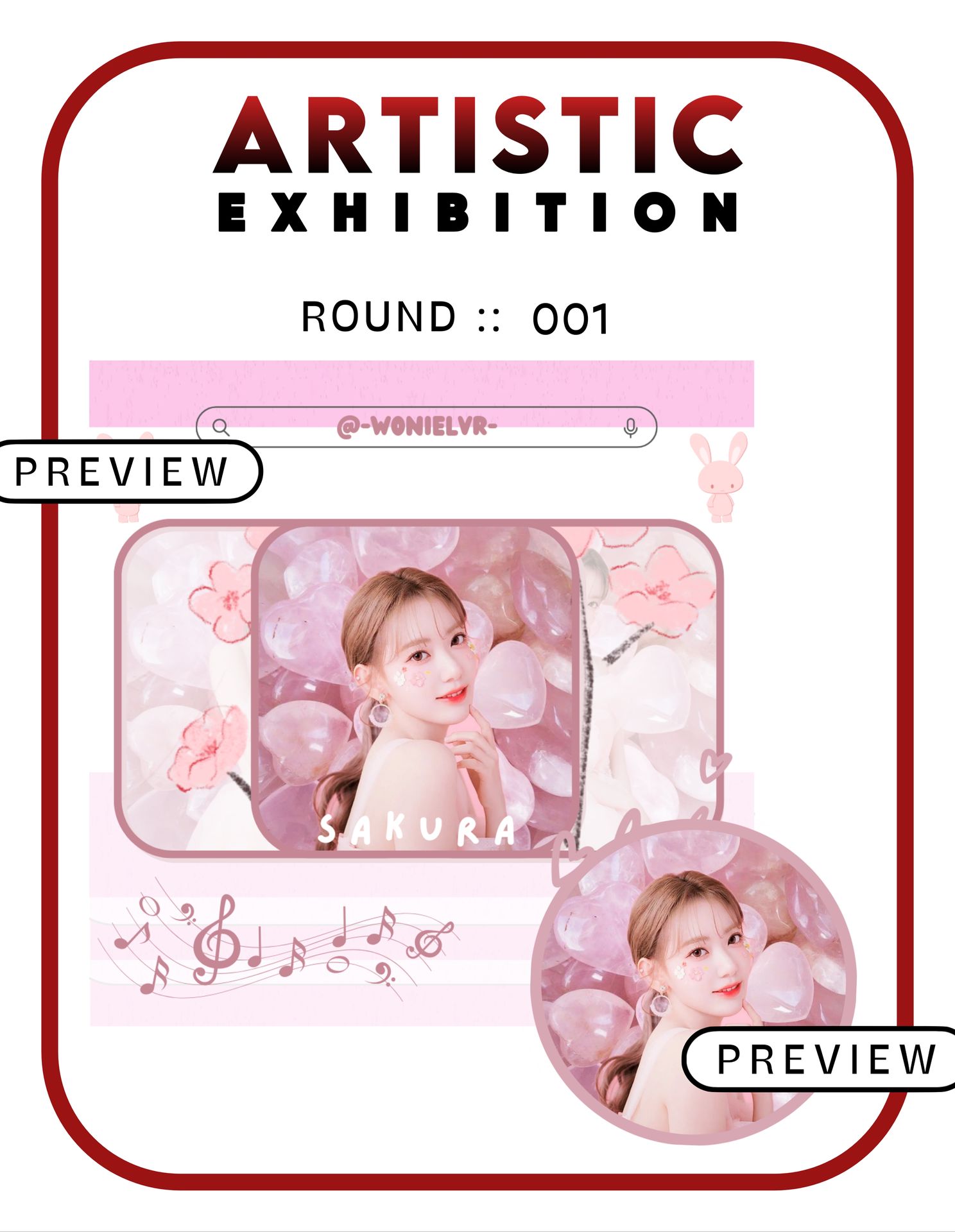
5. -wonielvr-
Review ::
⟡ Originality:: 12.5/15
⟡ Creativity:: 12/15
⟡ Elemental use:: 6.5/10
⟡ Quality: 10/10
⟡ Prompt relevance:: 15/20
⟡ Punctuality:: 10/10
Total:: 66/80
The theme looks refreshing, capturing a perfect light mood. The face looks stylish and pretty. It follows most of the prompt requirements but the major drawback would be the colour scheme, its deviating towards pastel shades than the solid colours.
Loved the use of flowers, hearts in the background which reflects overlays used in some social media platforms. However, the name "Sakura" at the bottom could benefit from stronger contrasting colours or bolder typography to make it more prominent.
The social media elements are chosen appropriately but could have been distributed better for visual balance. They look scattered a little.
Overall, the theme is really attractive with a perfect background overlay selection. The use of a little darker shades and cohesive placements of elements will enhance the theme more.
6. whotfiscorii
Review ::
⟡ Originality:: 12/15
⟡ Creativity:: 10/15
⟡ Elemental use:: 5/10
⟡ Quality: 9/10
⟡ Prompt relevance:: 12/20
⟡ Punctuality:: 10/10
Total:: 58/80
I like how you explored new colours here. The face claim selection is suiting well to the concept. But the theme doesn't comply with social media concepts. It does have a use of social media elements. But the placement might be the problem. The use of too many pngs looks crowded and messy, especially at the bottom. Also, your watermark/username isn't added leading to a deduction of two marks.
Using sharpening and brightening filters can help to enhance the visuals more.
Overall, the theme is good. But with careful and planned placements, omitting a few pngs, and the use of filters, it will look more appealing.
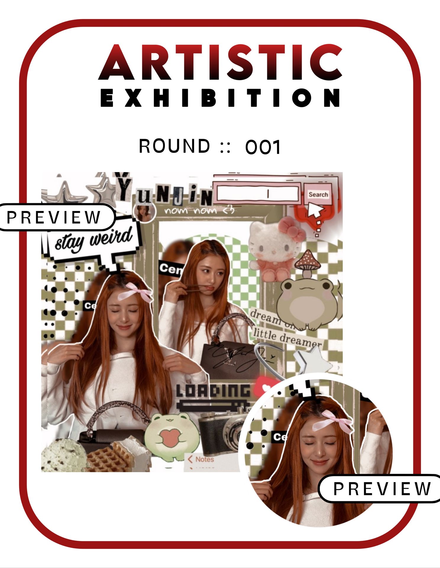
7. Seong_Grace
Review ::
⟡ Originality:: 7/15
⟡ Creativity:: 7/15
⟡ Elemental use:: 4/10
⟡ Quality: 9/10
⟡ Prompt relevance:: 7.5/20
⟡ Punctuality:: 8.5/10
Total:: 43/80
If I'm right you have recently begin theme designing and I must say it is a great attempt. The elements used behind look great. And the face claim gives out a stylish appearance. But the theme majorly misses the prompt criteria. It doesn't follow the social media concept. Please stick to the prompt requirement. Also the face claim's cut out is uneven as well. The colours are moving to vibrancy more. Though I liked the colour combination, it would look better while following the solid colour scheme.
Overall, as a beginner in theme designing it was a great attempt. It only lacked in following the prompt. Please don't be discouraged, you are doing great overall. Good luck for your future theme designing endeavours. I will send you your certificate on discord.

> The following contestants will move on to round 2 .ᐟ.ᐟ
⌗ kindly mark your presence in the round 2 prompt chapter once it's up. congratulations and good luck for the upcoming rounds !

Bạn đang đọc truyện trên: Truyen2U.Com