⌗ r.esults
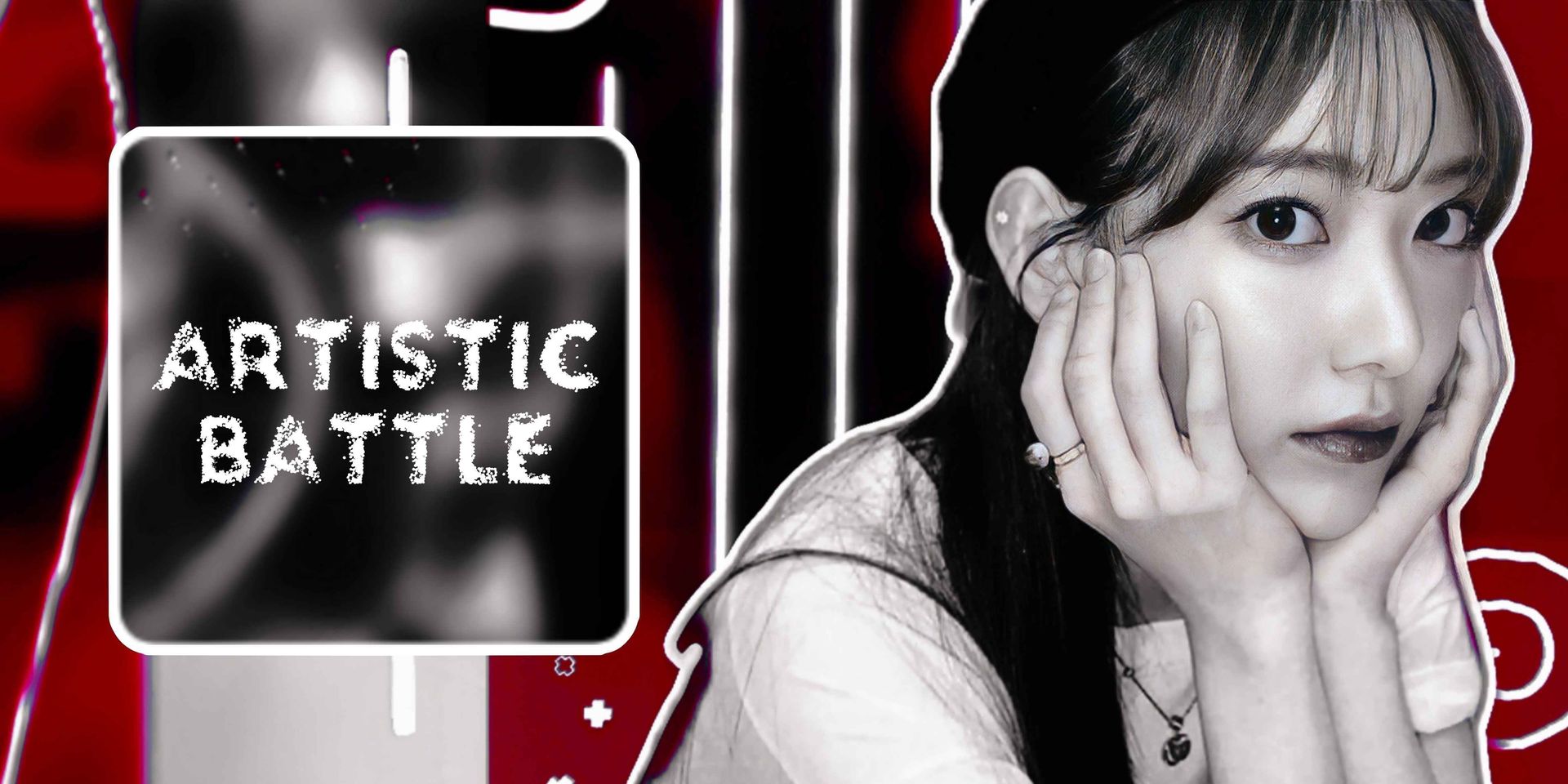
❝who is the winner?

ᶻ 𝗓 𐰁 Let's dive into the battlefield and celebrate for the victorious .ᐟ
1. esthvtic-

Review ::
⟡ Originality:: 13/15
⟡ Creativity:: 14/15
⟡ Elemental use:: 10/10
⟡ Quality: 8/10
⟡ Prompt relevance:: 20/20
⟡ Punctuality:: 8/10
Total:: 73/80.
It was very clever of you to use a greyscale monochrome. The colors perfectly sync with the prompt criteria. The elemental use is very apt as well. The retro-style overlays add a unique touch to the theme. The icon doesn't give much of a glowy effect maybe due to the filters used. Whenever using glowy png add them after the filter is used because a few filters make them appear less shiny. Also, the quality can be worked up in certain areas. Overall, the theme follows the prompt very well and has a unique approach.

Review ::
⟡ Originality:: 14/15
⟡ Creativity:: 14/15
⟡ Elemental use:: 10/10
⟡ Quality: 9/10
⟡ Prompt relevance:: 15/20
⟡ Punctuality:: 10/10
Total:: 72/80.
The theme is creative with a fusion of monochrome and futuristic/cyber-punk vibes. The combination goes very well. And the perfect selection of shades of teal adds more to the chosen concept. It was a good idea to use different shades for elements than the background. It makes the details stand out. Font selection, especially for Felix's name is one of the best ones from other entries.
The only drawback would be how the overlays colour is deviating to muted gold from teal shade.
Overall, it's a perfect dark mood theme with a slight deviation from monochrome.
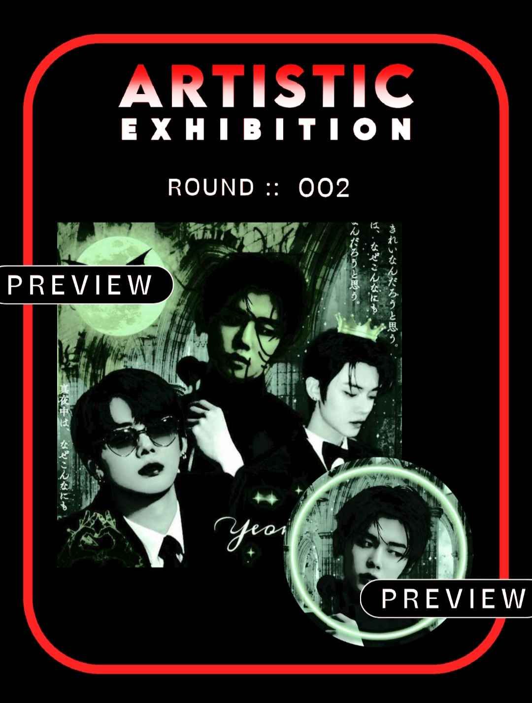
Review ::
⟡ Originality:: 12.5/15
⟡ Creativity:: 14.5/15
⟡ Elemental use:: 7/10
⟡ Quality: 9/10
⟡ Prompt relevance:: 19/20
⟡ Punctuality:: 10/10
Total:: 72/80.
I just love how well a monochrome style is reflected through this theme. It's remarkable how you could catch the trick of how to use all the same color elements together yet make them stand out. The only major drawback would be the area on the right bottom left empty when the other side of it has more use of elements. Maybe you could distribute them a little to that side as well. Since it doesn't look messy, adding more elements on the empty side would also work. Like adding Yeonjun's name to that place instead. In larger and a different bolder font.
Overall, it's a perfect dark-mood monochrome theme with subtle changes.
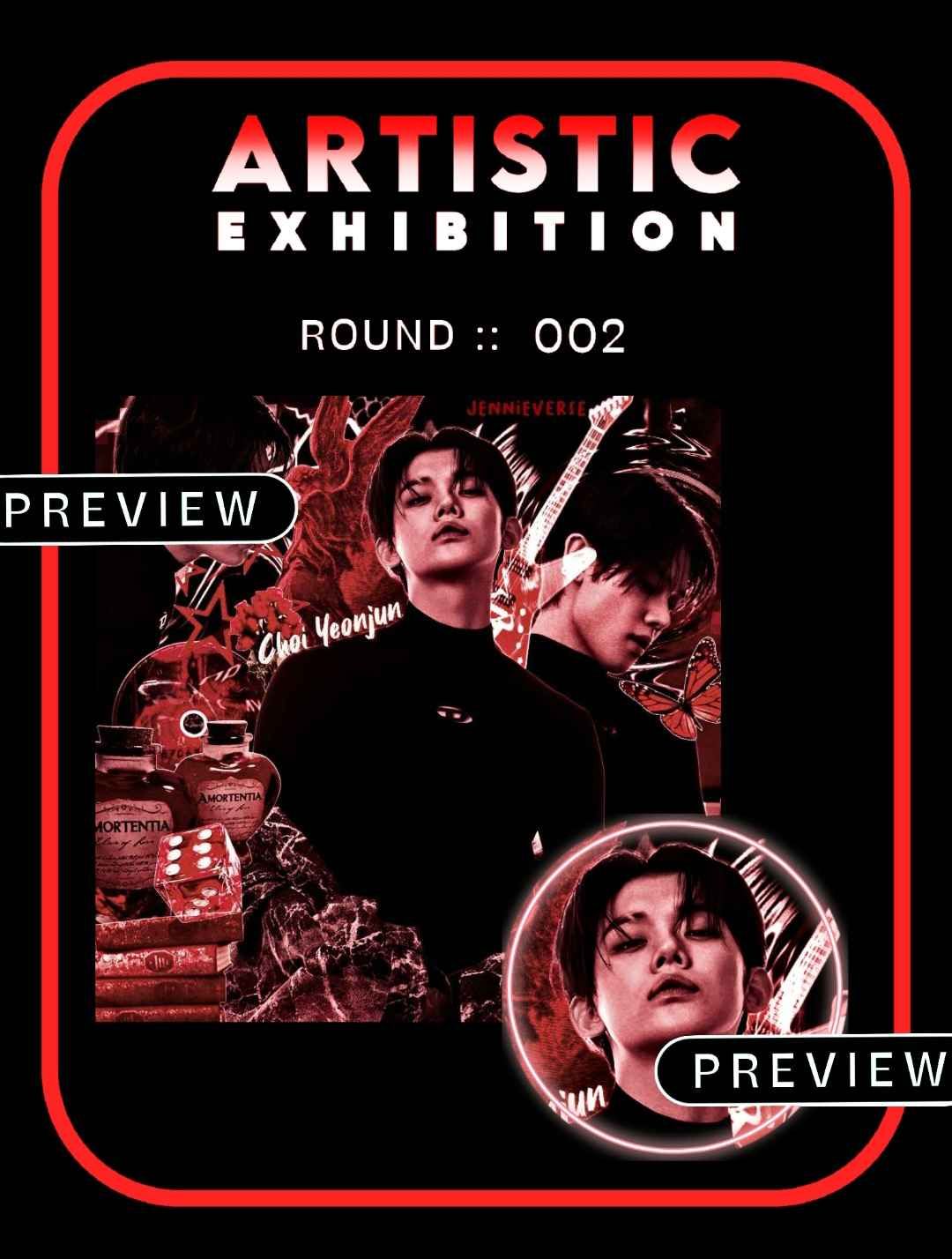
4. AraBTS07
Review ::
⟡ Originality:: 13/15
⟡ Creativity:: 13/15
⟡ Elemental use:: 7/10
⟡ Quality: 9/10
⟡ Prompt relevance:: 19/20
⟡ Punctuality:: 10/10
Total:: 71/80.
The uniqueness of the theme is the highlight and hero element here. I liked how monochrome and gothic concept is fused. And the monochrome criteria are followed throughout. But the fonts could be changed a little. Something going well with the creepy elements used. Also adding a few overlays over the face claims. The icon matches well with the background and prompt as well.
Overall, it's a unique theme with subtle changes required.
5. -wonielvr-
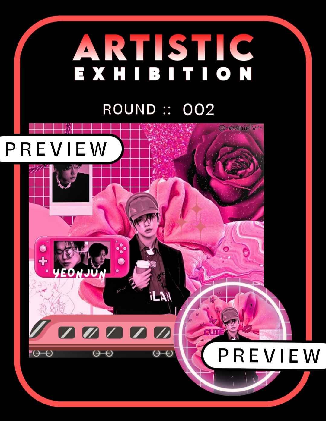
Review ::
⟡ Originality:: 12.5/15
⟡ Creativity:: 13/15
⟡ Elemental use:: 6/10
⟡ Quality: 8.5/10
⟡ Prompt relevance:: 17/20
⟡ Punctuality:: 8/10
Total:: 65/80.
It's impressive how well the elements are picked to match the monochrome style. Yet again, yeonjun's name could be written in a different font maybe with a darker shade of pink. I liked how distinctive the overall design is from the other entries. Maybe enlarging the face claims a little could benefit more. Even though the elements are spread out it looks a little empty. Using elements in different sizes balances the widespread layout.
Overall, the theme is really distinctive with a monochrome approach. However, the imbalance in the face claim and elemental distribution is a drawback.
6. whotfiscorii
Review ::
⟡ Originality:: 10/15
⟡ Creativity:: 9/15
⟡ Elemental use:: 5/10
⟡ Quality: 10/10
⟡ Prompt relevance:: 6/20
⟡ Punctuality:: 10/10
Total:: 50/80.
The theme is very pretty with an aesthetic approach. The color combination is good as well. But the main concern is that it's not a monochrome theme which was the main element of the round. The face claim placements go well as well. The glowy border is not included either. If the round was about manip theme style this would have gotten a high score legit. Please stick to the prompt given in contests. Don't feel discouraged, you are doing great as a beginner. I wish you luck in your future endeavors. I will send you the certificate on pinterest.

> The following contestants will move on to round 3 .ᐟ.ᐟ
⌗ kindly mark your presence in the round 3 prompt chapter once it's up. congratulations and good luck for the pcoming rounds !

Bạn đang đọc truyện trên: Truyen2U.Com